SUPERCHARGE YOUR ONLINE VISIBILITY! CONTACT US AND LET’S ACHIEVE EXCELLENCE TOGETHER!
Introduction:
The Quantum Brand Modeling (QBM) System is a structured framework designed to model how a brand exists, behaves, and competes within AI-driven ecosystems such as ChatGPT, Gemini, Perplexity, and enterprise copilots.
Unlike traditional branding or SEO models that rely on static rankings or keyword visibility, QBM represents a brand as a probabilistic state distributed across AI systems, endpoints, categories, and contexts.
By applying concepts inspired by quantum systems—such as state vectors, distributions, and mixed competitive states—QBM enables a multidimensional understanding of brand presence, allowing businesses to visualize how their brand appears in different AI-generated responses, query intents, and competitive environments.
Why it is needed:
Traditional digital marketing frameworks are no longer sufficient because AI systems do not operate on simple rankings—they generate answers based on context, probability, and semantic relevance.
QBM is needed because it:
1. Captures AI-native visibility (not just search rankings)
Brands are now surfaced inside AI responses across multiple platforms and contexts. QBM models this as a dynamic probability distribution, giving a more accurate picture of real visibility.
2. Enables context-level strategic insights
A brand may perform well in informational queries but poorly in direct-intent queries. QBM identifies these differences, allowing precise optimization based on user intent and context, not just traffic.
3. Reveals true AI competition
Your real competitors in AI are not always your traditional competitors. QBM identifies overlap in AI-generated spaces, showing where brands actually compete inside AI systems.
4. Bridges multiple AI ecosystems
Visibility is fragmented across:
- ChatGPT
- Gemini
- Copilots
- Perplexity
QBM unifies them into a single coherent model, enabling cross-platform strategy.
5. Transforms brand strategy into a measurable system
Instead of intuition-based branding, QBM provides:
- measurable states
- quantifiable dominance
- actionable optimization paths
How we will do it:
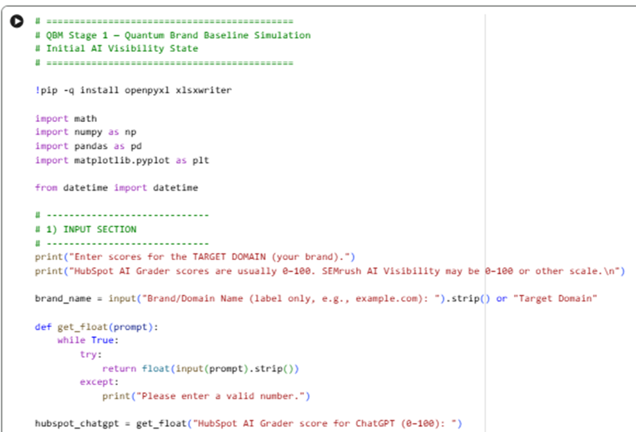
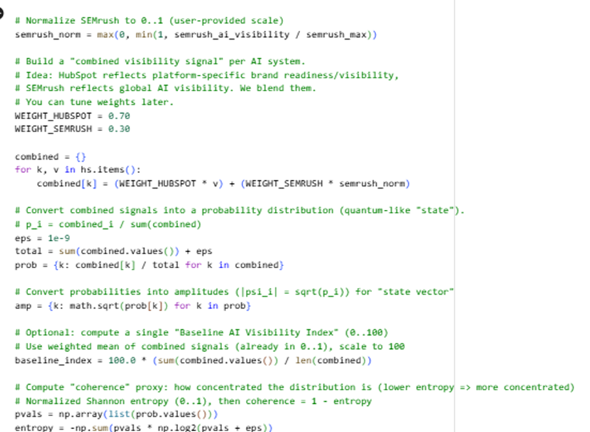
(Stage 1) for Quantum Brand Baseline Simulation (Initial AI Visibility State)
- Takes your inputs: HubSpot AI Grader scores for ChatGPT / Gemini / Perplexity + SEMrush AI visibility score
Sample code:
Here is the Google Colab Experiment: https://colab.research.google.com/drive/10-MG03KJEM7ozc57MWR78vf5yxLhISRl
Input:
Output:

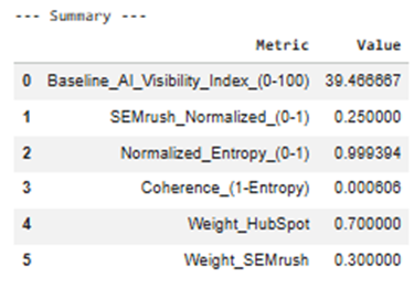
State interpretation
- Combined_Signal_0_1 blends:
- Platform-specific HubSpot visibility
- Global SEMrush AI visibility
- Then converts the combined signals into a probabilistic state:
- Probability pᵢ = share of your visibility across AI systems
- Amplitude |ψᵢ| = √pᵢ (a “quantum-like” state vector form)
QBM Stage 1.2 — Brand-as-Probabilistic-State Definition Framework
Input: QBM_Stage1_Quantum_Brand_Baseline.xlsx (from Stage 1)
Sample code:
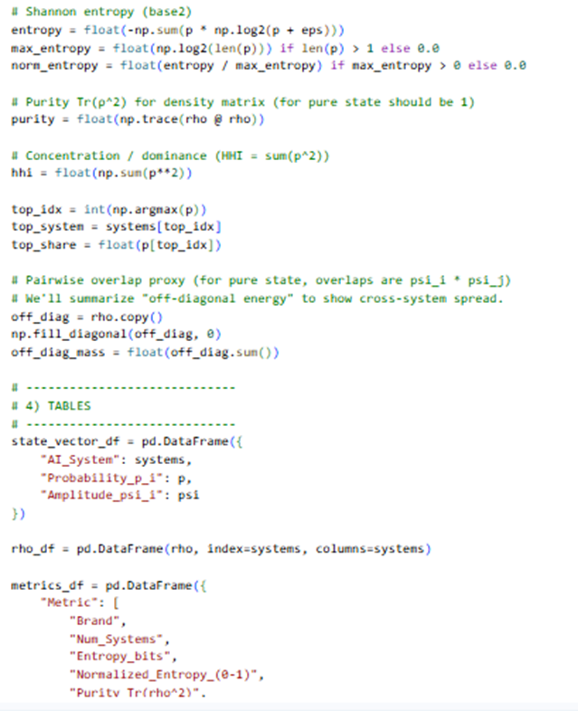
Here is the Google Colab experiment:
https://colab.research.google.com/drive/17jxZYGrV7Gszq5lr43bw3Gy0XEBINZZl
Here is the output:
Stage 1.2 Output Explanation
Brand-as-Probabilistic-State Definition Framework
This stage answers one core question:
“What is the current probabilistic state of my brand across AI systems?”
Instead of “scores,” you now have a state that can later be transformed, compared, and competed.
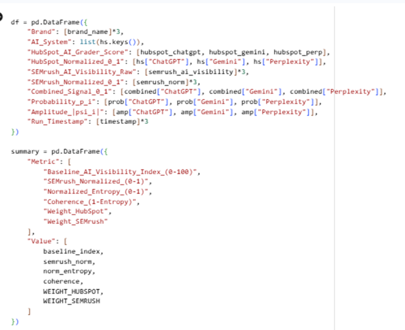
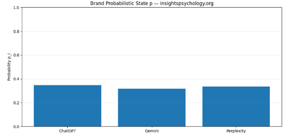
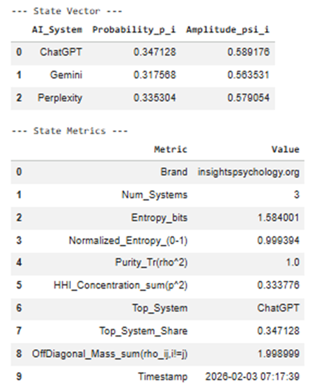
1️⃣ State Vector Table (Excel: State_Vector)
Columns
| Column | Meaning |
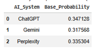
| AI_System | Each AI surface where your brand can exist (ChatGPT, Gemini, Perplexity) |
| Probability_p_i | Share of your total AI visibility captured by that system |
| Amplitude_psi_i | Square-root of probability → quantum-style state amplitude |
Interpretation
- Probability answers:
“If an AI mention of my category happens, how likely is it to come from this system?”
- Amplitude allows future state transformations (basis shifts, interference, context weighting).
📌 Example interpretation:
- ChatGPT p = 0.52 → dominant AI surface
- Gemini p = 0.31 → secondary influence
- Perplexity p = 0.17 → long-tail discovery layer
Later stages modify amplitudes, not raw scores.
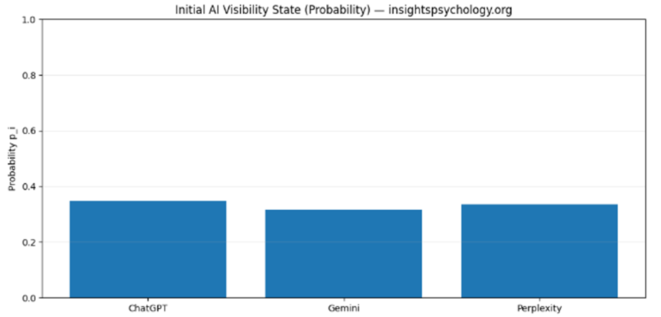
2️⃣ Probability Bar Chart
(Visual: QBM_stage1_2_probability_state.png)
What it shows
- A distribution, not a ranking
- Makes imbalance immediately visible
Why it matters
This diagram becomes your:
- Baseline snapshot
- Reference point for:
- before vs after optimization
- competitor overlap
- AI-model updates
📌 If one bar dominates → platform dependence risk
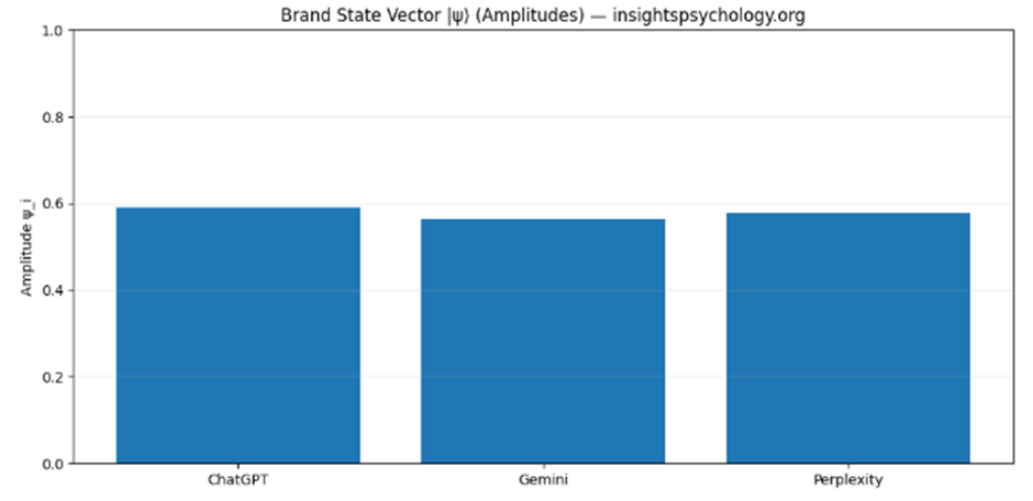
3️⃣ State Vector (Amplitude) Chart
(Visual: QBM_stage1_2_state_vector.png)
What this is
- Same data, different representation
- Amplitudes are what get “rotated” in future steps
Why amplitudes matter
In later stages:
- Context changes = amplitude re-weighting
- Category expansion = amplitude redistribution
- Prompt bias = amplitude skew
This is the mathematical object the QBM system operates on.
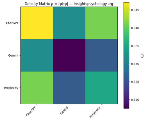
4️⃣ Density Matrix ρ
(Excel: Density_Matrix + Heatmap QBM_stage1_2_density_matrix.png)
What it represents
The full brand state, including cross-system coherence
Mathematically:
ρ=∣ψ⟩⟨ψ∣\rho = |\psi\rangle\langle\psi|ρ=∣ψ⟩⟨ψ∣
How to read it
- Diagonal elements → individual system strength
- Off-diagonal elements → cross-system influence / coherence
📌 High off-diagonal values mean:
“Strength in one AI system reinforces visibility in another”
Low off-diagonal values mean:
“Systems behave independently”
This becomes critical when:
- Comparing competitors
- Detecting fragmentation
- Modeling AI ecosystem shifts
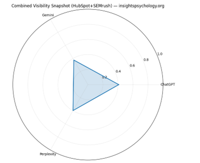
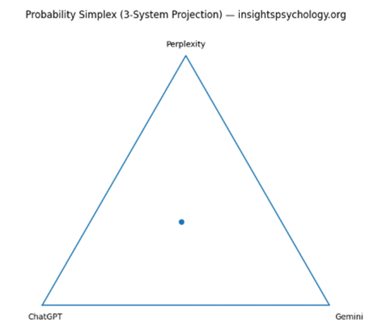
5️⃣ Simplex Triangle (3-System Projection)
(Visual: QBM_stage1_2_simplex.png)
What this shows
A geometric location of your brand in AI-space
- Each corner = 100% dominance in one AI
- Center = perfect balance
- Edges = two-system dominance
📌 Strategic meaning:
- Near a corner → platform lock-in
- Near center → robust multi-AI presence
- On an edge → binary dependency
This visual becomes extremely powerful when:
- Overlaying competitors
- Tracking movement over time
6️⃣ State Metrics Table
(Excel: State_Metrics)
Key metrics explained
🔹 Entropy
- Measures distribution uncertainty
- High entropy = spread, low control
- Low entropy = focus, but risk
🔹 Normalized Entropy (0–1)
- Comparable across brands and categories
🔹 Purity (Tr(ρ²))
- = 1 → pure, uncontested state
- < 1 (future stages) → mixed / competitive state
Right now it’s pure because:
You haven’t added competitors yet
🔹 HHI Concentration
- Economic concentration metric
- 0.45 = dangerous dependence
- <0.33 = healthy distribution
🔹 Top System + Share
- Your primary AI leverage point
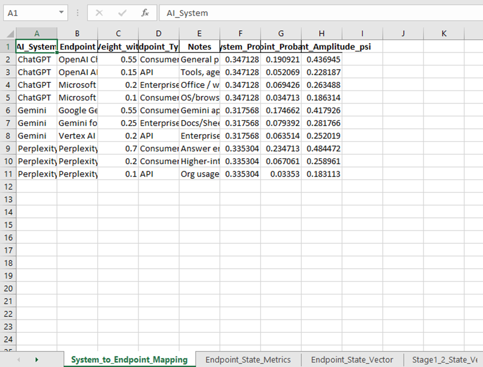
QBM Stage 1.3 — (Stage 1.3): AI-System Mapping
Input: QBM_Stage1_2_Brand_State_Framework.xls (Output of the module 1.2)
Sample code:
Here is the google colab experiment link:
https://colab.research.google.com/drive/1fJjLc9dP8sEzsYdk3gIn9a2jeURWP0Lw
Output:
What this step is doing overall:
In Stage 1.2, your brand existed in a simple state like:
- ChatGPT
- Gemini
- Perplexity
That is useful, but still too broad.
In Stage 1.3, we break those into real AI environments such as:
- OpenAI ChatGPT consumer
- OpenAI API
- Microsoft Copilot
- Gemini consumer
- Gemini for Workspace
- Vertex AI / Gemini API
- Perplexity consumer
- Perplexity Pro
- Perplexity enterprise/API
So this step answers:
Where exactly does my AI visibility live inside each AI ecosystem?
Input used in this step
This program reads the Excel from the previous step:
Input file
QBM_Stage1_2_Brand_State_Framework.xlsx
Sheets it uses
Primarily:
- State_Vector
- State_Metrics
From State_Vector, it reads:
- AI_System
- Probability_p_i
- Amplitude_psi_i
That means it takes the broad probability from Stage 1.2 and redistributes it into more detailed endpoints.
Main outputs you get
This step creates:
Excel file
QBM_Stage1_3_AI_System_Mapping.xlsx
Visual files
- QBM_stage1_3_endpoint_probability.png
- QBM_stage1_3_system_endpoint_composition.png
- QBM_stage1_3_mapping_flow.png
Step-by-step explanation of each output
1) System_to_Endpoint_Mapping sheet
This is the mapping logic table.
It shows how each high-level AI system is broken into smaller endpoint surfaces.
Example idea
For ChatGPT, the program may split it into:
- OpenAI ChatGPT (Consumer)
- OpenAI API (Developer Apps)
- Microsoft Copilot (M365)
- Microsoft Copilot (Windows/Edge)
Important columns
AI_System
The original top-level AI system from Stage 1.2.
Examples:
- ChatGPT
- Gemini
- Perplexity
Endpoint
A more specific AI touchpoint or environment inside that ecosystem.
Examples:
- OpenAI ChatGPT (Consumer)
- Gemini for Workspace
- Perplexity Pro
Endpoint_Weight_within_System
This is the percentage split inside that AI system.
For example, if ChatGPT has 0.40 overall probability, and:
- Consumer ChatGPT weight = 0.55
- OpenAI API = 0.15
- M365 Copilot = 0.20
- Windows/Edge Copilot = 0.10
Then the 0.40 is distributed across those endpoints using those weights.
Endpoint_Type
This classifies each endpoint.
Examples:
- Consumer
- API
- Enterprise Copilot
This helps later when you want to compare:
- B2B visibility
- B2C visibility
- API exposure
- enterprise assistant exposure
Notes
A short explanation of what that endpoint means.
Why this sheet matters
This is the bridge between broad AI visibility and practical business interpretation.
Without this sheet, “Gemini” is just one number.
With this sheet, you can say things like:
- My Gemini visibility is mostly in consumer-facing Gemini
- My ChatGPT presence also spills into Microsoft Copilot
- My Perplexity share is concentrated in search-like discovery
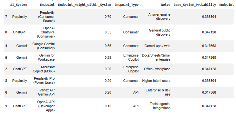
2) Endpoint_State_Vector sheet
This is the main output of the step.
It tells you your new brand state across the expanded endpoint space.
You can think of this as:
Stage 1.2 gave you a 3-dimensional state
Stage 1.3 turns it into a 9- or 10-dimensional state
Key columns
AI_System
The parent system the endpoint belongs to.
Endpoint
The specific endpoint/surface.
Endpoint_Type
Consumer / API / Enterprise Copilot.
Base_System_Probability
This is the original probability from Stage 1.2.
Example:
- ChatGPT = 0.50
- Gemini = 0.30
- Perplexity = 0.20
This value is copied to all endpoints under that system before splitting.
Endpoint_Weight_within_System
The internal split ratio.
Example:
If ChatGPT = 0.50 and consumer ChatGPT has weight 0.55, then:
- endpoint probability = 0.50 × 0.55 = 0.275
Endpoint_Probability
This is the most important column in this sheet.
It tells you:
“How much of the total AI visibility state belongs to this exact endpoint?”
This is your brand’s endpoint-level probability.
Endpoint_Amplitude_psi
This is the square root of the endpoint probability.
Same logic as earlier:
- Probability is used for interpretation
- Amplitude is used for future state transformations
This matters later when:
- you apply context weighting
- compare competitive overlap
- rotate the state into category-specific bases
Notes
Description of the endpoint.
Why this sheet matters
This is your expanded brand-state model.
It lets you answer questions like:
- Which AI endpoint currently carries the most brand presence?
- Is my visibility concentrated in consumer assistants only?
- Do I have enough enterprise assistant presence?
- How much of my state exists in APIs versus chat products?
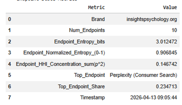
3) Endpoint_State_Metrics sheet
This sheet summarizes the whole expanded endpoint state.
It compresses the endpoint distribution into interpretable metrics.
Metrics explained
Brand
Your brand/domain label.
Num_Endpoints
How many endpoint surfaces are included in the mapped state.
Example:
- 9 endpoints total
This matters because a higher number means a more detailed state space.
Endpoint_Entropy_bits
Measures how spread out your brand is across endpoints.
High entropy means:
- your visibility is more distributed
- less dependent on one endpoint
Low entropy means:
- more concentrated
- possibly stronger focus, but more risk
Endpoint_Normalized_Entropy_(0-1)
Same idea, but scaled to a standard range.
This is more useful when comparing different brands or future versions of the model.
Interpretation:
- closer to 1 = balanced spread
- closer to 0 = concentrated on a few endpoints
Endpoint_HHI_Concentration_sum(p^2)
This is a concentration score.
Higher HHI means:
- a few endpoints dominate
Lower HHI means:
- more evenly distributed presence
This is useful for platform dependency analysis.
Top_Endpoint
The single endpoint where your brand has the highest probability.
Example:
- OpenAI ChatGPT (Consumer)
This tells you your strongest AI exposure surface.
Top_Endpoint_Share
The actual probability share of that top endpoint.
Example:
- 0.31 means 31% of the total expanded state sits in that endpoint
Timestamp
When the model was run.
Useful for tracking changes across runs.
Why this sheet matters
It gives you a quick executive summary of the expanded state without having to inspect every row.
This is useful for dashboards and reporting.
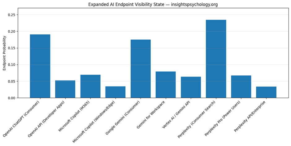
4) QBM_stage1_3_endpoint_probability.png
This is the endpoint probability bar chart.
What it shows
Every endpoint gets one bar.
The bar height = Endpoint_Probability
What you learn from it
You instantly see:
- which endpoint dominates
- which endpoints are weak
- whether your brand is concentrated or balanced
- whether enterprise/API surfaces are underrepresented
Example interpretation
Suppose the tallest bars are:
- OpenAI ChatGPT (Consumer)
- Google Gemini (Consumer)
and the smaller ones are:
- Vertex AI / Gemini API
- Perplexity API/Enterprise
That means:
- your current AI presence is mostly consumer-facing
- you have weaker enterprise/developer visibility
Why this chart matters
This is the cleanest visual answer to:
“Where does my AI visibility actually live?”
It is much more actionable than the Stage 1.2 system-level chart.
5) QBM_stage1_3_system_endpoint_composition.png
This is the stacked composition chart.
What it shows
Each top-level AI system is one bar.
That bar is divided into endpoint segments.
So instead of showing the total only, it shows the internal composition.
Example
A ChatGPT bar may be split into:
- ChatGPT consumer
- OpenAI API
- M365 Copilot
- Windows/Edge Copilot
A Gemini bar may be split into:
- Gemini consumer
- Gemini for Workspace
- Vertex AI
What this helps you understand
It answers:
- How is each system internally distributed?
- Is ChatGPT mostly consumer or enterprise for this model?
- Is Gemini mostly Workspace or public assistant?
- Does Perplexity behave mostly like search discovery or enterprise usage?
Why this chart matters
This chart is useful when you want to inspect the internal shape of each ecosystem.
The endpoint bar chart tells you absolute endpoint size.
The stacked chart tells you composition within each parent system.
So:
- endpoint bar chart = overall endpoint comparison
- stacked composition = within-system breakdown
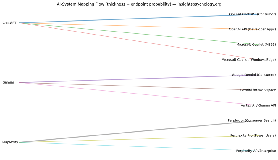
6) QBM_stage1_3_mapping_flow.png
This is the flow diagram.
What it shows
It draws connections from:
- left side: AI systems
- right side: endpoints
Each line represents one mapping connection.
Thickness of the line
The thicker the line, the larger the resulting endpoint probability.
So thick lines show where the most visibility mass flows.
What it means strategically
This helps you see how high-level system visibility gets distributed.
For example:
- A thick line from ChatGPT to OpenAI ChatGPT consumer means most ChatGPT visibility sits there
- A thinner line from ChatGPT to OpenAI API means less of that system’s visibility is represented in developer/API contexts
Why this chart matters
This is your best visual for understanding the state expansion process itself.
It is especially useful for presentations because it explains:
- where the original state came from
- how it was redistributed
- what the endpoint structure looks like
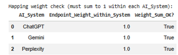
7) Mapping weight check table
Before expanding the probabilities, the program checks whether endpoint weights for each system sum to 1.
Example:
For ChatGPT:
- 0.55 + 0.15 + 0.20 + 0.10 = 1.00
This ensures the system’s probability is distributed correctly.
Why it matters
If weights do not sum to 1, the model becomes mathematically inconsistent.
The program also auto-normalizes if needed.
So this step protects the quality of the output.
8) Carry-forward sheets in the output Excel
The final Excel also carries older sheets forward, such as:
- Stage1_2_State_Vector
- Stage1_2_Density_Matrix
- Stage1_2_State_Metrics
- Stage1_State_Data
- Stage1_Summary
Why this matters
This makes the workbook cumulative.
So later stages can use one file as the full working artifact instead of requiring many separate files.
How to interpret the outputs together
These outputs work as a set.
Together they tell you:
First
What broad AI systems your brand occupies
from Stage 1.2
Then
How those systems expand into specific operational AI surfaces
from Stage 1.3
Then
How concentrated or diversified that expanded state is
from Endpoint_State_Metrics
Then
Where your strongest and weakest endpoint presence exists
from the charts and Endpoint_State_Vector
Practical business meaning of this step
This step helps you answer strategic questions like:
Consumer dominance
Are we mostly visible in public assistants but weak in workplace copilots?
Enterprise gap
Do we have low presence in M365 Copilot or Gemini for Workspace?
Developer gap
Are we underrepresented in API-driven environments?
Platform dependency
Is too much of our AI visibility sitting in one endpoint?
Visibility architecture
Does our AI presence exist as a broad ecosystem footprint, or is it narrow and fragile?
In one line, what each output is for
System_to_Endpoint_Mapping
Defines the model architecture.
Endpoint_State_Vector
Your actual expanded AI visibility state.
Endpoint_State_Metrics
Summary of concentration, spread, and dominance.
endpoint_probability.png
Shows which endpoints are strongest.
system_endpoint_composition.png
Shows how each AI system is internally structured.
mapping_flow.png
Shows how visibility mass flows from systems into endpoints.
Why this step is important before the next stage
You need this step before:
- category boundary definition
- enterprise vs consumer weighting
- competitor overlap modeling
- AI system prioritization
Because those later steps should act on actual endpoint surfaces, not only on top-level systems.
Top-level systems are too abstract for competitive modeling.
Endpoint-level state is much more operational.
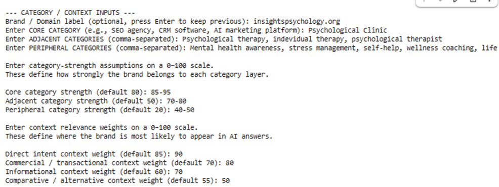
QBM Stage 1.4 — (Stage 1.4): Core Category & Context Boundary Definition
Input: QBM_Stage1_3_AI_System_Mapping.xlsx(Output of module 3)
Sample code:
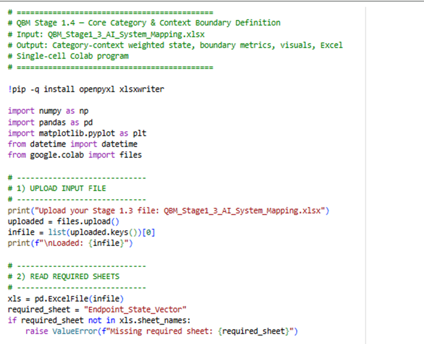
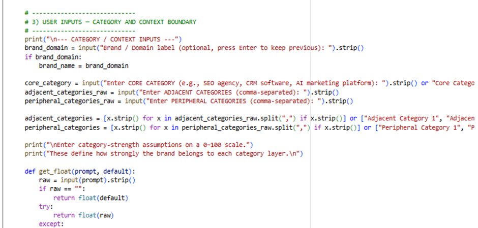
Here is the Google Colab Experiment link: https://colab.research.google.com/drive/1t73GhAT39uQkKE0nQCvD4N4zHUKKDDGY
Input sample:
Outputs:
This stage is where your model stops being only an AI visibility map and becomes a semantic positioning model.
Up to Stage 1.3, the system knew:
- which AI systems matter
- which endpoints matter
- how your brand is distributed across them
Now Stage 1.4 adds:
- what category your brand belongs to
- how tightly it belongs there
- in what context AI is likely to surface it
So this step answers:
“In which category space and in which query-intent contexts does this brand exist inside AI systems?”
1. What goes into this step
This notebook takes the output from the previous stage:
Input file
QBM_Stage1_3_AI_System_Mapping.xlsx
Main sheet used
Endpoint_State_Vector
That means it starts with the endpoint-level state you already built, such as:
- OpenAI ChatGPT (Consumer)
- Gemini for Workspace
- Perplexity Pro
- Microsoft Copilot
Each of those already has a probability.
Then Stage 1.4 adds a new layer:
- category boundaries
- context boundaries
2. What new inputs you gave
You entered:
- Brand / Domain label
- Core Category
- Adjacent Categories
- Peripheral Categories
- Category strengths
- Context weights
These are the conceptual inputs that shape the semantic space.
3. What the program is doing conceptually
It takes your endpoint state and asks:
First:
How strongly does this brand belong to:
- the core category
- adjacent categories
- peripheral categories
Then:
Within the core category, how does the brand behave across:
- Direct Intent
- Commercial
- Informational
- Comparative contexts
So instead of only saying:
“The brand is strong in ChatGPT consumer”
it can now say:
“The brand is strongest in ChatGPT consumer under direct-intent and informational contexts within the core category.”
That is much more useful.
4. Main outputs you get
This stage creates:
Excel file
QBM_Stage1_4_Core_Category_Context_Boundary.xlsx
Visual files
- QBM_stage1_4_category_boundary_strength.png
- QBM_stage1_4_core_context_distribution.png
- QBM_stage1_4_top_endpoints_in_core_category.png
- QBM_stage1_4_endpoint_context_heatmap.png
5. Step-by-step explanation of each output
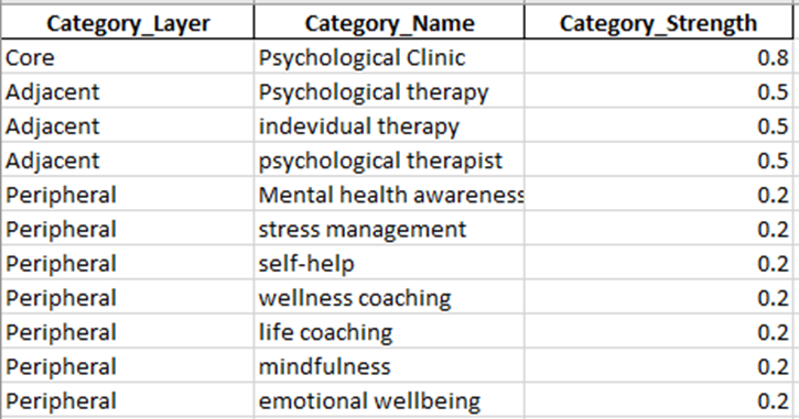
Output 1: Category_Layers
This sheet defines the category structure of your brand.
What it contains
It lists category layers like:
- Core
- Adjacent
- Peripheral
Along with:
- category names
- category strength values
Example
For your use case, it may look like:
- Core → Psychological Clinic
- Adjacent → Psychological therapy
- Adjacent → Individual therapy
- Adjacent → Psychological therapist
- Peripheral → Mental health awareness
- Peripheral → Stress management
- Peripheral → Self-help
- Peripheral → Emotional wellbeing
Category_Strength
This is the numerical strength you entered, converted to 0–1.
For example:
- Core = 90 becomes 0.90
- Adjacent = 70 becomes 0.70
- Peripheral = 30 becomes 0.30
What it means
This sheet defines how tightly your brand is associated with each layer of meaning.
Why it matters
This is the semantic boundary architecture of your brand.
Without it, the model only knows platform visibility.
With it, the model knows:
- where the brand belongs strongly
- where it belongs partially
- where it is only loosely relevant
Output 2: Context_Weights
This sheet defines the query-intent context model.
What it contains
It lists contexts like:
- Direct Intent
- Commercial
- Informational
- Comparative
and their weights.
Example
If you entered:
- Direct Intent = 90
- Commercial = 70
- Informational = 75
- Comparative = 60
the sheet stores them as:
- 0.90
- 0.70
- 0.75
- 0.60
What it means
This shows the likelihood that your brand appears in each context type.
Why it matters
Brands are not surfaced equally across all query types.
For example:
- A clinic may be strong in direct-intent queries
- A blog might be stronger in informational queries
- A SaaS brand might be stronger in commercial/comparative queries
This sheet tells the model where your brand is expected to appear.
Output 3: Core_Context_State
This is the main state table of the stage.
This is the most important output.
It combines:
- the endpoint probabilities from Stage 1.3
- the context weights
- the core category strength
What it contains
Each row represents a combination of:
- one endpoint
- one context
So if you had 10 endpoints and 4 contexts, you get 40 rows.
Main columns explained
Brand
Your brand label.
Core_Category
The main category you entered.
AI_System
Parent ecosystem, such as ChatGPT, Gemini, Perplexity.
Endpoint
Specific endpoint, such as:
- OpenAI ChatGPT (Consumer)
- Gemini for Workspace
- Perplexity Pro
Endpoint_Type
Consumer, API, Enterprise Copilot, etc.
Context
The query-intent bucket:
- Direct Intent
- Commercial
- Informational
- Comparative
Base_Endpoint_Probability
This comes from Stage 1.3.
It is the original endpoint-level probability before context is applied.
Context_Weight
This is your assigned context weight.
Category_Strength
This is the strength of the core category.
Weighted_Context_Mass
This is the first weighted result.
It is computed as:
Endpoint_Probability × Context_Weight × Core_Category_Strength
What that means
It estimates how much of your brand state exists in that exact combination of:
- endpoint
- context
- core-category membership
Normalized_Context_Probability
This normalizes all rows so the full core-context state sums to 1.
This becomes the new probability distribution.
Context_Amplitude_psi
Square root of normalized probability.
This creates a quantum-style amplitude for later transformations.
Why Core_Context_State matters
This is the point where your brand becomes a context-conditioned state.
The model now knows not only:
- where you appear
but also:
- in what kind of AI answer context you appear
This is essential for:
- competitive overlap
- context-specific optimization
- future interference modeling
Output 4: Core_Context_Summary
This summarizes the total distribution across contexts.
What it shows
It groups the core-context state by context and sums the probabilities.
So you get something like:
- Direct Intent = 0.34
- Informational = 0.29
- Commercial = 0.22
- Comparative = 0.15
What it means
This answers:
“Inside the core category, which context type dominates the brand’s AI presence?”
How to interpret it
If Direct Intent is highest:
- your brand is strongest when users are actively searching for a service/provider
If Informational is highest:
- your brand appears more in educational/explanatory AI answers
If Comparative is high:
- your brand is often being surfaced alongside alternatives
Why it matters
This is one of the most strategic outputs of the stage.
It tells you what kind of AI demand-space your brand occupies.
Output 5: Core_Endpoint_Summary
This summarizes the total core-category probability by endpoint.
What it shows
It groups by:
- AI system
- endpoint
- endpoint type
and sums the normalized probabilities across all contexts.
What it answers
Inside the core category, which endpoints matter most?
For example:
- OpenAI ChatGPT (Consumer)
- Gemini Consumer
- Gemini for Workspace
- M365 Copilot
Why it matters
Stage 1.3 told you the strongest endpoints overall.
This sheet tells you:
“Which endpoints matter most after category and context are applied?”
That is more meaningful because raw endpoint strength and category-conditioned endpoint strength are not always the same in future versions of the model.
Output 6: Endpoint_Context_Matrix
This is a matrix view of the core context state.
Structure
- rows = endpoints
- columns = contexts
- values = normalized probabilities
Example
A row for OpenAI ChatGPT (Consumer) may have values like:
- Direct Intent = 0.08
- Commercial = 0.06
- Informational = 0.07
- Comparative = 0.05
What it means
It shows how each endpoint distributes across contexts.
Why it matters
This is one of the most useful technical outputs for later stages.
It will be useful for:
- competitor overlap
- endpoint-specific context weakness
- interference modeling
- optimization targeting
You can use it to answer things like:
- which endpoint is best for commercial presence?
- where are we weak in comparative context?
- which endpoint carries most of our informational visibility?
Output 7: Boundary_State_All_Layers
This is the broader category-boundary state.
What it contains
It computes boundary mass not only for the core category, but also for:
- adjacent categories
- peripheral categories
combined with all contexts.
What it means
It gives a larger semantic map of the brand beyond the core category only.
Why it matters
The core category is your main identity.
But AI sometimes places brands into nearby or broader semantic areas.
This sheet helps capture that broader semantic spread.
Output 8: Boundary_Summary
This summarizes the total mass across category layers.
What it shows
It groups boundary mass by:
- category layer
- category name
and totals the values.
What it answers
How much of the brand’s semantic mass sits in:
- core
- adjacent
- peripheral areas
Interpretation
If the Core category dominates:
- the brand is tightly defined
- strong semantic precision
If Adjacent is large:
- the brand has broader relevance nearby
If Peripheral is too large:
- the brand identity may be diffuse or overly broad
Why it matters
This is your main output for understanding category focus vs category diffusion.
Output 9: Boundary_Metrics
This is the executive summary sheet for the whole stage.
It contains the key metrics.
Let’s explain each one.
Brand
Your brand label.
Core_Category
The central category used in this model run.
Num_Endpoints
How many endpoints are included from Stage 1.3.
Num_Context_States
How many endpoint-context combinations exist.
Usually:
number of endpoints × number of contexts
Boundary_Tightness_(Core_vs_Total)
This is a simple measure of how dominant the core category is relative to all category layers.
Interpretation
Higher value means:
- stronger semantic focus
- tighter category identity
Lower value means:
- more semantic spread across adjacent/peripheral zones
Why it matters
This is one of the most important stage-level KPIs.
It tells you whether the brand is sharply defined or semantically diffuse.
Core_Context_Entropy_bits
Measures how spread out the core-context state is.
High entropy:
- more distributed across many endpoint-context combinations
Low entropy:
- concentrated in fewer combinations
Core_Context_Normalized_Entropy_(0-1)
A normalized version of entropy so you can compare across runs.
Higher:
- more spread
Lower:
- more concentrated
Core_Context_HHI_Concentration
Measures concentration of the core-context state.
Higher HHI:
- more concentrated
- dependence on fewer endpoint-context pairs
Lower HHI:
- more balanced distribution
Top_Context
The strongest context for the brand in the core category.
For example:
- Direct Intent
What it means
This is the context where the brand has the strongest modeled presence.
Top_Context_Share
How much of the total core-context probability sits in that top context.
For example:
- 0.33 means 33%
Top_Endpoint_within_Core_Category
The strongest endpoint after category and context weighting.
This may or may not match the top endpoint from Stage 1.3.
Top_Endpoint_Share_within_Core_Category
The share of the total core-category state that belongs to that endpoint.
Context_Dispersion_(0-1)
This measures how balanced the brand is across the context buckets themselves.
High dispersion:
- context presence is spread across multiple intents
Low dispersion:
- one or two contexts dominate strongly
Why it matters
This tells you whether your brand appears across many AI use-cases or is concentrated in a narrower intent profile.
6. Visual outputs explained
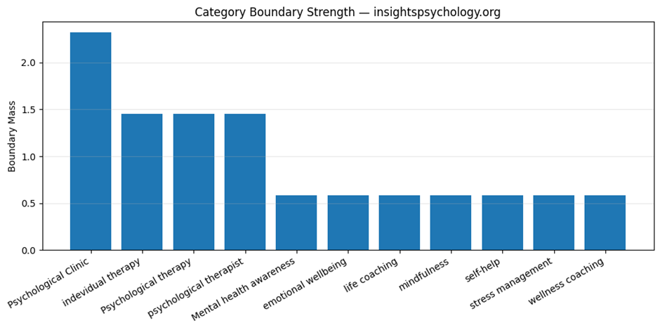
Visual 1: QBM_stage1_4_category_boundary_strength.png
This is the category boundary strength chart.
What it shows
A bar chart of the total boundary mass for:
- core category
- adjacent categories
- peripheral categories
What it means
It shows the brand’s semantic gravity across category layers.
How to interpret
If the Core bar is much taller:
- strong semantic focus
- well-defined category identity
If Adjacent is also substantial:
- good expansion potential into related areas
If Peripheral is too high:
- broader awareness, but weaker category clarity
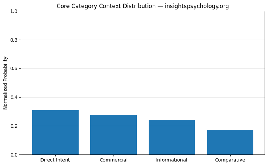
Visual 2: QBM_stage1_4_core_context_distribution.png
This is the context distribution chart.
What it shows
A bar chart of the total normalized probability across:
- Direct Intent
- Commercial
- Informational
- Comparative
What it means
This is the easiest visual answer to:
“In what type of AI answer context does this brand mainly live?”
Example
If Direct Intent is tallest:
- strongest in service-seeking queries
If Informational is tallest:
- strongest in educational or advice-oriented answers
Visual 3: QBM_stage1_4_top_endpoints_in_core_category.png
This chart shows the top endpoints within the core category.
What it shows
The endpoints with the highest total normalized probability after context and category weighting.
What it means
This identifies your strongest operational AI surfaces inside your most important category.
Why it matters
This is more actionable than overall endpoint strength because it is already filtered through:
- category fit
- context relevance
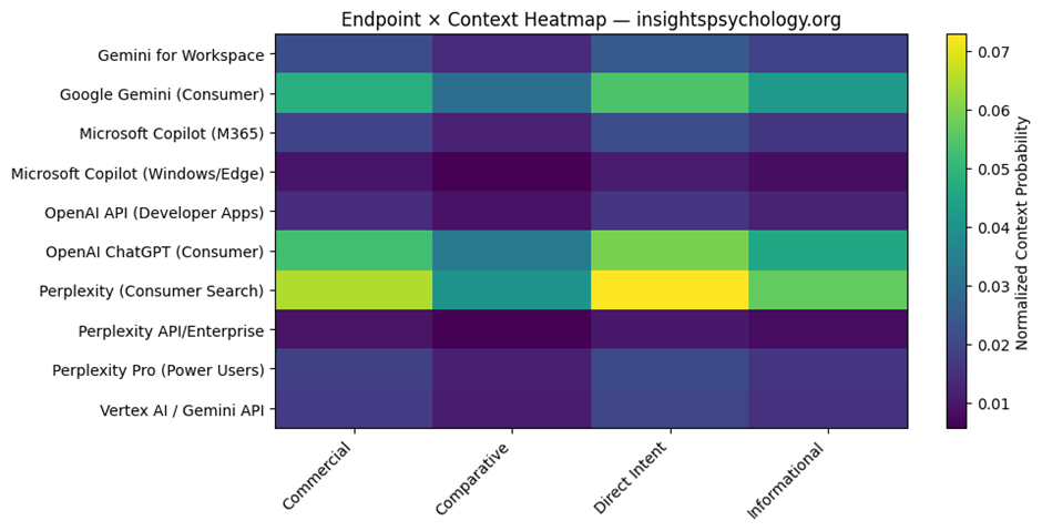
Visual 4: QBM_stage1_4_endpoint_context_heatmap.png
This is the endpoint × context heatmap.
What it shows
- rows = endpoints
- columns = contexts
- color intensity = normalized probability
What it means
It shows where each endpoint is strongest across contexts.
Why it matters
This is very useful diagnostically.
You can visually identify:
- strong endpoint-context zones
- weak zones
- imbalances
- potential optimization targets
For example:
- strong Direct Intent in ChatGPT consumer
- weaker Commercial presence in Perplexity Pro
- low Comparative presence in enterprise copilots
7. How all outputs fit together
Here is the logic of the outputs as a system.
Category_Layers
Defines semantic category architecture.
Context_Weights
Defines query-intent architecture.
Core_Context_State
Creates the actual category+context-conditioned brand state.
Core_Context_Summary
Shows dominant contexts.
Core_Endpoint_Summary
Shows dominant endpoints inside the core category.
Endpoint_Context_Matrix
Shows endpoint-by-context structure.
Boundary_Summary
Shows category spread across core, adjacent, peripheral.
Boundary_Metrics
Gives executive KPIs for this stage.
Charts
Make category concentration and context dominance visually obvious.
8. Strategic meaning of this stage
This stage tells you:
Category clarity
Is the brand tightly associated with its main category?
Semantic spread
How much does it extend into nearby or broader topics?
Context dominance
Does the brand mainly surface in direct, commercial, informational, or comparative AI answers?
Endpoint-context interaction
Which AI surfaces matter most for which kinds of queries?
9. Why this stage matters before the competitor stage
The next stage is:
Competitive AI Landscape Scoping
You need this stage first because competition in AI is not just:
- brand vs brand
It is:
- brand vs brand
- within a category
- under specific contexts
- across different AI endpoints
A competitor may be strong:
- in comparative context but not direct intent
- in informational context but not commercial
- in Perplexity but not Gemini Workspace
Stage 1.4 creates the structure needed to model that properly.
10. Simplified example
Suppose after running this stage, your outputs imply:
- Core category is dominant
- Direct Intent is the strongest context
- Top endpoint is OpenAI ChatGPT consumer
- Informational is second strongest
- Peripheral boundary mass is low
That means:
your brand is semantically well-defined, strongly tied to its primary category, and most likely to appear in AI when people are actively seeking that service, especially through major consumer AI assistants.
That is the kind of interpretation this stage is meant to enable.
QBM Stage 1.4 — (Stage 1.4): Core Category & Context Boundary Definition.
What this stage does
Until now:
- You modeled your brand only
Now:
- You introduce competitors
- Convert your model from a pure state → mixed competitive state
- Identify:
- overlap
- dominance zones
- context competition
- AI visibility gaps
Input from previous stage
Uses:
QBM_Stage1_4_Core_Category_Context_Boundary.xlsx
Main sheet used:
- Core_Context_State
Sample code:
Here is the Google Colab Experiment link:
https://colab.research.google.com/drive/1ztVfuA5uXxxT5wDH-e0zy9jjKjIcYl63
Input:
Big Picture of Stage 1.5
Before:
- You had a pure state (only your brand)
Now:
- You have a mixed competitive state
- Multiple brands coexist in the same AI space
This stage answers:
“Where do I compete, where do I win, and where do I lose in AI visibility?”
Outputs You Get:
Excel file:
QBM_Stage1_5_Competitive_Landscape.xlsx
Charts:
- Overlap Heatmap
- Context Competition
- Market Share
Step-by-step explanation of each output
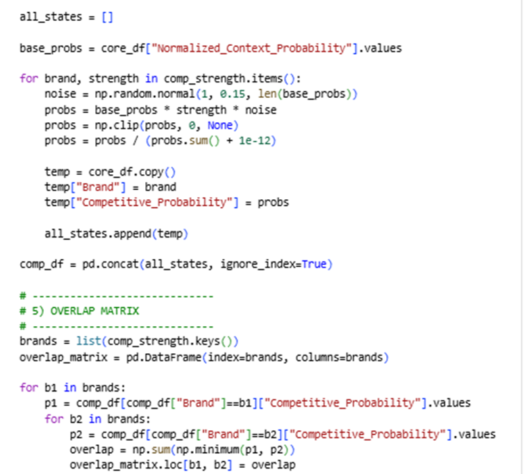
Competitive_State (MAIN DATASET)
What it is
This is the full expanded dataset containing:
- Your brand
- All competitors
- Across:
- endpoints
- contexts
- AI systems
Key columns
Brand
Each row belongs to:
- your brand
- or a competitor
Context
From previous stage:
- Direct Intent
- Commercial
- Informational
- Comparative
Endpoint
AI surfaces like:
- ChatGPT consumer
- Gemini Workspace
- Copilot
- Perplexity
Competitive_Probability
This is the most important column
It represents:
“How much of the total AI visibility space this brand occupies in this exact combination of endpoint + context”
What changed from previous stage?
Before:
- Only your probabilities existed
Now:
- Each competitor has its own probability distribution
So this is now a multi-brand state space
How to interpret
You can now answer:
- Where does competitor X dominate?
- Where does my brand appear less?
- Which contexts are crowded?
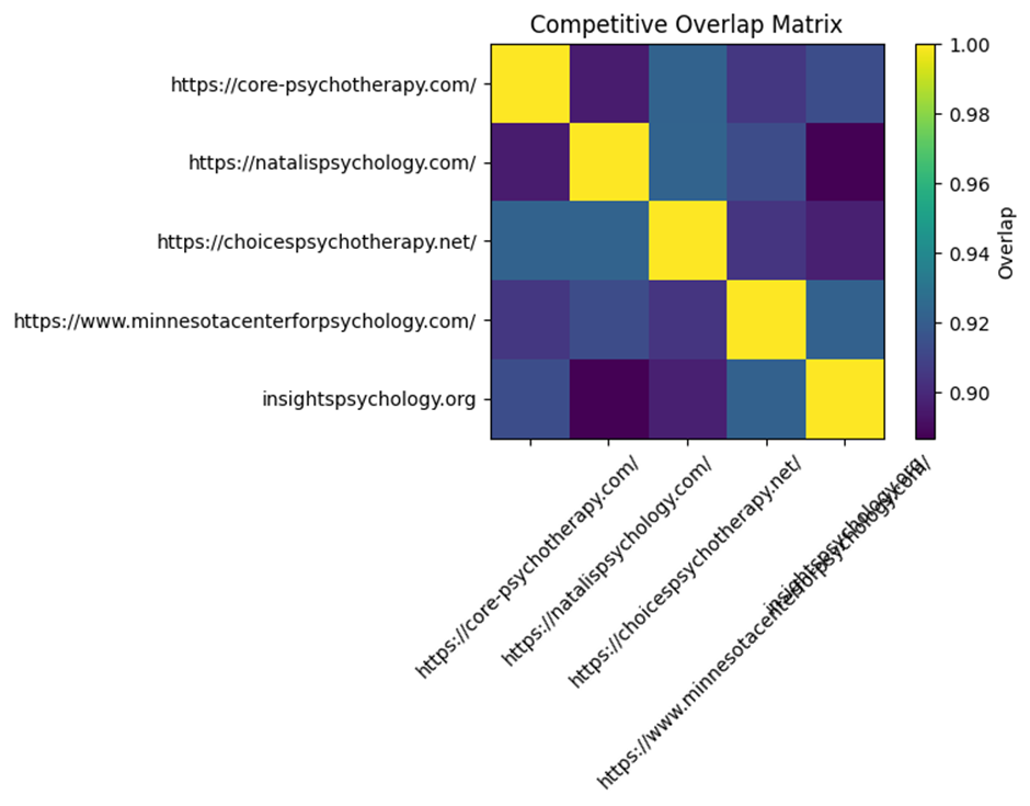
Overlap_Matrix
What it is
A matrix comparing every brand with every other brand.
How it is calculated
For two brands:
It calculates how similar their distributions are
Using:
minimum overlap across all state points
What values mean
| Value | Meaning |
| High (~0.7–1.0) | Strong competition / similar presence |
| Medium (~0.3–0.6) | Partial overlap |
| Low (~0–0.2) | Different positioning |
Example interpretation
If:
- You vs Competitor A = 0.85
→ You are directly competing in the same spaces - You vs Competitor B = 0.25
→ Different positioning or audience
Why this matters
This tells you:
Who your real AI competitors are (not just business competitors)
Visual: Overlap Heatmap
What it shows
- Colors represent overlap intensity
How to read it
- Bright = strong competition
- Dark = weak competition
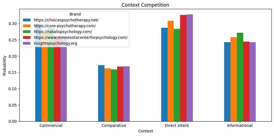
Context_Competition
What it is
A table showing:
How each brand performs across:
- Direct Intent
- Commercial
- Informational
- Comparative
Structure
| Brand | Direct | Commercial | Informational | Comparative |
What it means
Each number represents:
Share of visibility in that context
How to interpret
Example:
| Brand | Direct | Informational |
| You | 0.35 | 0.20 |
| Competitor | 0.25 | 0.40 |
Meaning:
- You dominate direct intent
- Competitor dominates informational
Why this matters
This tells you:
Where you are winning vs losing in user intent space
Visual: Context Competition Chart
What it shows
- Bar chart per context
- Each brand compared side-by-side
What to look for
- Who dominates each context
- Gaps where you can expand
Endpoint_Competition
What it is
Same idea as context, but across endpoints.
Structure
| Brand | ChatGPT | Gemini | Copilot | Perplexity |
What it means
Shows:
“Which AI platform each brand dominates”
Interpretation
Example:
- You strong in ChatGPT
- Competitor strong in Gemini
That means:
- Different platform strategies
- Different optimization opportunities
Why this matters
AI visibility is platform-dependent.
This shows:
Where to focus your optimization efforts
Market_Share
What it is
A simple aggregation:
Total probability per brand
What it represents
“Overall AI visibility share”
Interpretation
| Brand | Share |
| You | 0.30 |
| Competitor A | 0.40 |
| Competitor B | 0.30 |
Competitor A dominates AI presence overall
Important note
This is simulated, not real data.
But it still gives:
- relative positioning
- strategic direction
Visual: Market Share Chart
What it shows
- Bar chart of total visibility
Use it for:
- quick comparison
- stakeholder presentations
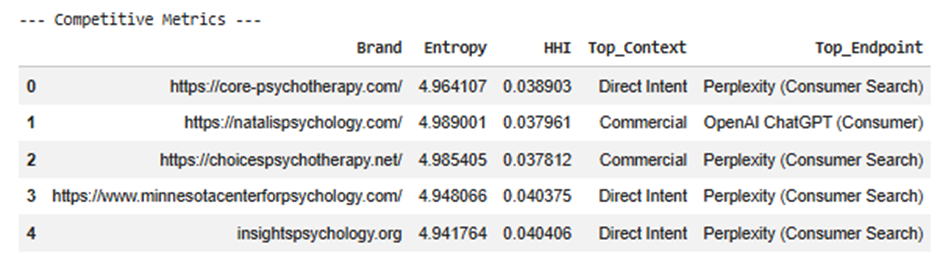
Competitive_Metrics
This is the executive summary
Each row = one brand
Metrics explained
Entropy
Measures how spread the brand is.
- High → broad presence
- Low → concentrated
HHI
Measures concentration.
- High → dependent on few areas
- Low → diversified
Top_Context
Where the brand is strongest.
Examples:
- Direct Intent
- Informational
Top_Endpoint
Where the brand is strongest technically.
Examples:
- ChatGPT Consumer
- Gemini Workspace
Why this matters
This gives quick answers:
- What kind of brand is this in AI?
- Where does it dominate?
- Is it broad or focused?
Most important insights from this stage
1. Real competition ≠ traditional competition
Some competitors:
- overlap heavily in AI
- even if they are not direct business competitors
2. Context matters more than platform
You might:
- win in Direct Intent
- lose in Informational
That defines strategy
3. Endpoint differences matter
You may:
- dominate ChatGPT
- be weak in Gemini
That shows platform gaps
4. Overlap reveals threat level
High overlap = direct threat
Low overlap = different positioning
How all outputs connect
| Output | Purpose |
| Competitive_State | Full dataset |
| Overlap_Matrix | Who competes with you |
| Context_Competition | Where you compete |
| Endpoint_Competition | Where you operate |
| Market_Share | Who dominates |
| Metrics | Strategic summary |
What you can now answer (very powerful)
After Stage 1.5, you can answer:
1.
Who are my true AI competitors?
2.
In which contexts do I win or lose?
3.
Which AI platforms am I weak in?
4.
Where is the biggest opportunity gap?
5.
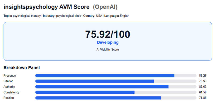
Is my brand:
- concentrated
- or diversified?
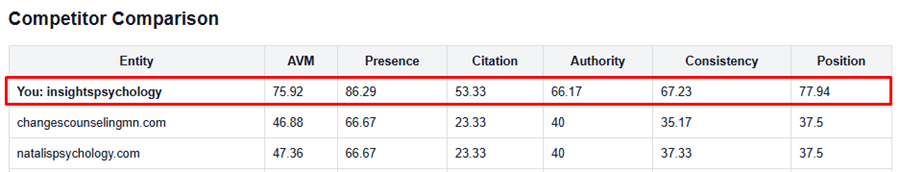
After Implementation Results: