FILL OUT THE FORM BELOW & ALLOW US TO TAKE YOUR UI SERVICES TO A WHOLE NEW LEVEL!
For years, businesses viewed User Interface (UI) design primarily as a visual discipline. Success was often measured by attractive layouts, modern color palettes, sleek animations, and aesthetically pleasing websites. While visual appeal remains important, the role of UI design has evolved dramatically.
Today’s digital users expect experiences that are fast, intuitive, personalized, and frictionless. They demand interfaces that understand their intent, guide them naturally through digital journeys, and deliver information exactly when they need it. At the same time, search engines, AI-powered platforms, and Large Language Models are becoming increasingly sophisticated in how they interpret, evaluate, and recommend digital experiences.
As a result, modern UI design now sits at the intersection of human psychology, behavioral science, artificial intelligence, user experience engineering, and search optimization.
This transformation has created a new standard for digital success.
Businesses can no longer afford to treat UI design as an isolated creative function. Instead, it must become a strategic business asset capable of improving engagement, driving conversions, enhancing discoverability, and supporting long-term growth across both traditional and AI-powered search ecosystems.
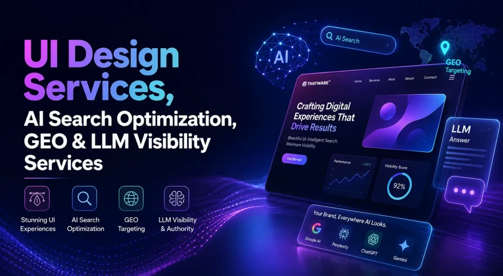
ThatWare’s AI-Powered UI Design Services were developed to meet these evolving demands. By combining advanced design methodologies, AI-driven insights, user behavior analysis, semantic architecture, and future-ready optimization frameworks, ThatWare creates digital experiences that are not only visually compelling but also strategically engineered for performance.
Whether your objective is increasing conversions, improving user engagement, strengthening brand perception, or preparing your digital assets for the future of AI-driven discovery, our approach provides a comprehensive solution that bridges design excellence with technological innovation.
Why User Interface Design Matters More Than Ever
The average user today has little patience for poor digital experiences.
Research consistently shows that visitors make judgments about a website within seconds. Those initial impressions often determine whether users continue their journey or abandon it altogether.
Poorly designed interfaces create friction.
Users become confused.
Navigation becomes difficult.
Important information becomes hard to find.
Trust begins to decline.
Conversions suffer.
Conversely, well-designed interfaces create clarity and confidence. They simplify decision-making, reduce cognitive load, and encourage users to move naturally toward desired actions.
A modern user interface directly influences:
- Customer engagement
- Lead generation
- Sales performance
- Brand trust
- Customer retention
- Search visibility
- Digital authority
As competition intensifies across virtually every industry, exceptional UI design has become a significant competitive advantage.
Businesses that invest in intelligent design strategies are increasingly outperforming competitors who continue relying on outdated design principles.
The Evolution of UI Design in the AI Era
The emergence of artificial intelligence has fundamentally changed how users discover information and interact with digital platforms.
Traditional search behavior is evolving.
Users are increasingly engaging with conversational systems, AI assistants, answer engines, and generative search experiences.
Platforms such as ChatGPT, Gemini, Claude, Perplexity, and Google AI Overviews are transforming how information is consumed.
Instead of navigating through multiple search results, users now expect direct answers, contextual recommendations, and personalized guidance.
This shift has significant implications for UI design.
Modern interfaces must satisfy two distinct audiences simultaneously:
Human Users
Users require intuitive navigation, accessibility, visual clarity, and engaging experiences.
Intelligent Systems
AI systems require structured information, semantic clarity, entity relationships, contextual relevance, and machine-readable architecture.
Successful digital experiences must address both requirements.
ThatWare’s approach integrates these considerations from the beginning of the design process, ensuring that interfaces perform effectively for users while remaining optimized for emerging AI-driven discovery environments.
What Are AI-Powered UI Design Services?
AI-powered UI design services combine traditional user interface principles with artificial intelligence, machine learning insights, behavioral analytics, and predictive optimization frameworks.
Rather than relying solely on assumptions or subjective design preferences, AI-enhanced design strategies leverage data to make smarter decisions.
This includes analyzing:
- User behavior patterns
- Interaction trends
- Navigation pathways
- Engagement metrics
- Conversion bottlenecks
- Search intent signals
- Audience segmentation
The result is a more intelligent, adaptive, and effective user experience.
At ThatWare, AI-powered UI design extends beyond automation.
It becomes a strategic framework for understanding how users think, behave, and interact with digital environments.
Every interface is designed to align user needs with business objectives while remaining adaptable to future technological advancements.
The ThatWare Philosophy: Beyond Traditional UI Design
Many agencies focus exclusively on visual design.
Others prioritize usability.
Some concentrate on technical implementation.
ThatWare combines all of these disciplines into a unified framework.
Our philosophy is based on a simple principle:
Every digital experience should simultaneously improve user satisfaction, business performance, and discoverability.
To achieve this, our UI services integrate multiple areas of expertise:
User Experience Research
Understanding how users interact with digital assets.
Behavioral Analytics
Identifying opportunities for optimization based on real user behavior.
Semantic Architecture
Creating information structures that improve both usability and machine understanding.
AI Search Readiness
Preparing websites for emerging search technologies with AI search optimization for UI Services.
Conversion Optimization
Maximizing business outcomes through strategic design decisions.
Continuous Improvement
Leveraging data-driven insights to refine performance over time.
This integrated approach allows businesses to build digital ecosystems capable of thriving in both today’s search environment and tomorrow’s AI-powered landscape.
Comprehensive UI Design Services by ThatWare
Strategic User Interface Design
Effective interfaces begin with strategy.
Before visual elements are developed, it is essential to understand:
- Business objectives
- Audience expectations
- Competitive landscape
- User behavior patterns
- Conversion goals
ThatWare develops strategic design frameworks that ensure every interface serves a measurable purpose.
Our UI design services include:
- Website interface design
- Mobile application interfaces
- SaaS dashboard design
- Ecommerce user interfaces
- Enterprise software interfaces
- Customer portals
- Product platforms
- AI application experiences
Each solution is tailored to support business growth while maintaining exceptional usability.
User Experience Design and Journey Optimization
User experience extends beyond visual appearance.
It encompasses every interaction users have with a digital environment.
Our UX specialists focus on creating seamless customer journeys through:
User Journey Mapping
Understanding how users navigate from awareness to conversion.
Information Architecture
Organizing content logically and intuitively.
User Flow Development
Creating efficient pathways toward desired actions.
Wireframing and Prototyping
Validating concepts before implementation.
Usability Testing
Ensuring experiences align with user expectations.
Accessibility Planning
Creating inclusive experiences for all users.
By improving the overall user journey, businesses can significantly increase engagement, satisfaction, and conversion performance.
AI-Driven User Behavior Analysis
One of the most valuable applications of artificial intelligence in UI design is behavioral analysis.
Traditional analytics often reveal what users are doing.
AI analysis helps uncover why they are doing it.
This deeper understanding enables businesses to identify:
- Navigation issues
- User frustrations
- Content gaps
- Engagement opportunities
- Conversion barriers
- Behavioral trends
These insights provide a stronger foundation for decision-making and continuous optimization.
Rather than relying on assumptions, design improvements can be guided by meaningful data.
Conversion-Centered Interface Design
Attractive interfaces are valuable.
However, business success ultimately depends on outcomes.
ThatWare’s conversion-focused methodology ensures that every design element supports specific objectives.
We optimize:
- Calls-to-action
- Content hierarchy
- Navigation systems
- Landing page structures
- Form design
- Checkout experiences
- Lead generation pathways
Every component is evaluated through the lens of user psychology and business impact.
The result is an interface that not only looks exceptional but also performs effectively.
Responsive and Adaptive Design Frameworks
Modern users access digital experiences from a wide range of devices.
Desktop computers, smartphones, tablets, foldable screens, smart displays, and emerging interfaces all require thoughtful consideration.
ThatWare creates responsive and adaptive design systems that maintain consistency across every environment.
Benefits include:
- Improved mobile usability
- Better user engagement
- Faster performance
- Consistent branding
- Enhanced accessibility
- Future scalability
A responsive experience is no longer optional.
It is a foundational requirement for digital success.
Accessibility as a Competitive Advantage
Accessibility is often misunderstood as merely a compliance requirement.
In reality, accessible design improves usability for everyone.
Accessible interfaces:
- Reach larger audiences
- Improve user satisfaction
- Strengthen brand reputation
- Enhance engagement metrics
- Support search performance
Our accessibility-first design approach considers:
- Readability
- Navigation simplicity
- Keyboard accessibility
- Screen reader compatibility
- Visual clarity
- Inclusive interaction patterns
By creating experiences that serve diverse audiences, businesses position themselves for broader digital growth.
Designing for Trust and Brand Authority
Trust is one of the most important factors influencing online behavior.
Users are more likely to engage, convert, and return when they trust a brand.
UI design plays a significant role in establishing that trust.
Elements such as:
- Visual consistency
- Clear messaging
- Professional presentation
- Transparent navigation
- Reliable interactions
all contribute to perceived credibility.
ThatWare helps businesses create interfaces that communicate authority, professionalism, and confidence from the first interaction.
AI Discovery Optimization for Modern Digital Experiences
The future of online visibility is no longer limited to traditional search engines.
For more than two decades, businesses primarily focused on ranking within search engine results pages. While search engine optimization remains important, a new layer of digital discovery is rapidly emerging.
Today, users increasingly rely on AI-powered platforms to find information, compare services, research solutions, and make purchasing decisions.
Platforms such as ChatGPT, Gemini, Claude, Perplexity, and Google AI Overviews are changing how people interact with information online.
Instead of browsing through multiple pages of search results, users now receive direct answers generated by artificial intelligence systems.
This shift introduces a new challenge for businesses.
If your website, content, and digital assets are not optimized for AI discovery, your visibility may decline even if your traditional rankings remain strong.
ThatWare addresses this challenge through a comprehensive AI visibility framework specifically designed to improve discoverability across emerging AI ecosystems.
Our AI discovery framework helps businesses improve:
- AI visibility
- LLM citations
- Generative search rankings
- Answer engine presence
- Semantic authority
- Knowledge graph strength
- Entity recognition
- AI discoverability
As AI becomes an increasingly important gateway to information, businesses must evolve their digital strategies accordingly.
Generative Engine Optimization (GEO) for Websites
Generative Engine Optimization for UI Services represents one of the most significant developments in modern digital marketing.
Unlike traditional search engines that provide lists of web pages, generative engines create direct responses using information gathered from multiple sources.
When users ask questions inside AI systems, those platforms generate answers rather than simply displaying links.
The challenge for businesses is ensuring they become part of those generated responses.
ThatWare’s GEO services are designed to increase the likelihood of brand inclusion within AI-generated answers.
Our GEO Framework Includes
Knowledge Graph Development
AI systems rely heavily on entities and relationships.
We help businesses establish stronger knowledge graph signals that improve machine understanding.
Entity Optimization
Brands, products, services, people, and topics are transformed into recognizable digital entities.
This improves AI comprehension and retrieval opportunities.
Semantic Topic Networks
We build interconnected content ecosystems that strengthen topical authority.
AI Citation Signals
Our strategies increase the probability of being referenced within generative search environments.
Vector Search Optimization
Modern AI systems utilize vector databases and semantic retrieval methods.
We optimize content structures to align with these technologies.
Contextual Authority Development
AI engines prioritize sources demonstrating expertise and authority.
Our frameworks strengthen these signals across digital assets.
The goal of GEO is simple.
Increase visibility wherever AI-generated answers influence decision-making.
Answer Engine Optimization (AEO) for Modern Websites
Search behavior is becoming increasingly conversational.
Instead of typing fragmented keywords, users now ask complete questions.
Examples include:
- What is the best UI design company?
- Which agency provides AI-powered user experience services?
- How can businesses improve website engagement?
- What are the benefits of AI-driven interface optimization?
- Who offers Generative Engine Optimization services?
Answer engines are designed to respond directly to these types of queries.
Businesses that optimize for conversational search gain a significant advantage.
ThatWare’s AEO Framework
Our Answer Engine Optimization process focuses on helping businesses capture these emerging opportunities.
Question-Based Content Architecture
We identify questions users are actively asking across search ecosystems.
Conversational Content Development
Content is structured around natural language interactions.
Intent Mapping
User intent is analyzed to align answers with search expectations.
Structured Data Implementation
Schema and semantic markup improve machine understanding.
Entity Reinforcement
Key business entities are optimized for answer engine recognition.
AI-Friendly Information Structures
Content is organized to improve retrieval and answer generation.
As answer engines continue to evolve, AEO for UI services becomes an essential component of future-ready digital strategies.
LLM Visibility Optimization for Businesses
Large Language Models have become powerful discovery platforms.
Millions of users now rely on AI systems to research products, services, technologies, and business solutions.
This trend continues to accelerate.
Businesses that establish visibility within Large Language Models gain access to an entirely new channel of customer acquisition.
ThatWare’s LLM visibility optimization framework helps organizations strengthen their presence across AI ecosystems.
Our approach focuses on:
- Entity recognition
- Semantic authority
- Knowledge graph expansion
- AI retrieval readiness
- Citation opportunities
- Contextual relevance
The objective is not merely visibility.
The objective is becoming a trusted source that AI systems consistently recognize and reference.
LLM SEO for Technology Companies
Technology brands operate in highly competitive digital environments.
Traditional SEO alone may no longer provide sufficient visibility.
Our LLM SEO for UI services framework helps technology companies improve discoverability across AI-powered search experiences.
Benefits include:
- Increased AI visibility
- Enhanced semantic authority
- Stronger entity recognition
- Improved citation opportunities
- Better retrieval performance
Whether launching innovative products or scaling enterprise platforms, technology businesses benefit from stronger AI ecosystem integration.
AI SEO for SaaS Companies
Software companies face unique visibility challenges.
Potential customers frequently research solutions using conversational AI tools before engaging with vendors.
ThatWare’s AI SEO services help SaaS businesses:
- Improve AI search visibility
- Strengthen product authority
- Enhance entity recognition
- Increase answer engine presence
- Improve semantic relevance
By optimizing for both users and AI systems, SaaS brands gain a competitive advantage in modern search environments.
GEO Services for Enterprise Organizations
Enterprise websites often contain thousands of pages and complex information structures.
This complexity can make AI understanding more difficult.
Our enterprise GEO services for UI help organizations:
- Build scalable entity frameworks
- Strengthen knowledge graph integration
- Improve semantic consistency
- Enhance discoverability
- Increase AI citation opportunities
Large organizations require sophisticated visibility strategies.
ThatWare provides enterprise-grade solutions designed for long-term success.
ChatGPT Optimization for Websites
ChatGPT has become one of the most influential AI platforms in the world.
Millions of users rely on it for recommendations, research, and decision-making.
Businesses increasingly seek visibility within ChatGPT-generated responses.
ThatWare’s ChatGPT Optimization framework focuses on improving:
Entity Authority
Strong entity signals improve recognition across AI systems.
Semantic Clarity
Clear contextual relationships help AI understand content accurately.
Knowledge Graph Strength
Expanded knowledge graph associations support retrieval opportunities.
Topical Expertise
Demonstrating subject authority increases recommendation potential.
AI Citation Readiness
Optimized content structures improve visibility within generated responses.
As AI adoption continues to expand, ChatGPT optimization becomes an increasingly valuable competitive advantage.
Gemini Optimization for Websites
Google’s Gemini ecosystem is reshaping how users interact with information.
Because Gemini is closely integrated with Google’s broader infrastructure, businesses must prepare for AI-driven discovery at scale.
ThatWare helps organizations optimize for Gemini through:
- Entity development
- Semantic search engineering
- Knowledge graph enhancement
- Structured content frameworks
- AI visibility optimization for UI Services
These strategies improve discoverability across Google’s evolving AI ecosystem.
Perplexity Optimization for Websites
Perplexity has gained significant attention because of its citation-driven answer model.
Unlike many AI systems, Perplexity often highlights sources directly.
This creates unique opportunities for businesses.
Our Perplexity optimization strategies focus on:
- Authority development
- Citation optimization
- Structured content creation
- Semantic relevance
- Entity strengthening
These initiatives improve the likelihood of being referenced within Perplexity-generated answers.
Industries Benefiting from AI-Powered UI Design
SaaS Companies
Improve onboarding experiences, retention, and product adoption.
Ecommerce Businesses
Enhance shopping experiences and increase conversion rates.
Healthcare Organizations
Deliver intuitive patient-focused experiences.
Financial Services
Strengthen trust and simplify complex user journeys.
Educational Institutions
Improve engagement and learning outcomes.
Enterprise Technology Providers
Create scalable experiences that support business growth.
Professional Service Firms
Improve lead generation and customer acquisition.
Regardless of industry, intelligent UI design creates measurable advantages.
Why Businesses Choose ThatWare
Digital transformation is no longer simply about having a visually appealing website or a modern-looking application. Today’s businesses operate in an environment where user expectations are constantly evolving, search technologies are becoming increasingly intelligent, and competition continues to intensify across virtually every industry. To remain competitive, organizations need more than attractive design. They need digital experiences that generate measurable business outcomes, support long-term growth, and adapt to emerging technologies.
At ThatWare, we believe that successful digital experiences are built at the intersection of design, technology, data, and artificial intelligence. Our approach extends far beyond traditional UI and UX methodologies. We combine advanced expertise across multiple disciplines to create intelligent digital ecosystems that help businesses improve engagement, increase conversions, strengthen brand authority, and prepare for the future of AI-driven discovery.
Artificial Intelligence Integration
Artificial Intelligence is transforming how users interact with digital platforms. ThatWare leverages AI-powered insights, predictive analytics, behavioral modeling, and intelligent automation to create interfaces that are more responsive to user needs. By understanding how users behave and what drives decision-making, we design experiences that improve engagement while supporting business objectives.
User Experience Design Excellence
Exceptional user experiences are at the core of every successful digital product. Our team focuses on understanding customer journeys, reducing friction points, and creating intuitive pathways that guide users naturally toward desired actions. Whether the goal is lead generation, product adoption, or customer retention, our UX strategies are designed to maximize user satisfaction and business performance.
Semantic Search Engineering
Search technology has evolved significantly from traditional keyword-based algorithms. Modern search systems rely heavily on context, intent, entities, and semantic relationships. ThatWare integrates semantic search engineering into digital experiences, helping businesses improve content discoverability while creating information structures that both users and intelligent systems can easily understand.
Technical SEO Expertise
Even the most beautifully designed interface can struggle if technical foundations are weak. Our team incorporates technical SEO best practices into every stage of the design process, ensuring that websites remain accessible, crawlable, indexable, and optimized for search visibility. This creates a strong foundation for sustainable organic growth.
Entity Optimization and Knowledge Graph Development
As AI-powered search platforms become more influential, entity-based optimization is becoming increasingly important. ThatWare helps businesses establish strong digital entity signals through knowledge graph development, semantic relationships, and contextual authority building. This improves how search engines, answer engines, and Large Language Models understand and reference your brand.
Conversion Optimization Frameworks
A successful digital experience should do more than attract visitors. It should convert them into customers, subscribers, leads, or loyal users. Our conversion optimization methodologies combine user psychology, behavioral data, interface design, and strategic testing to improve measurable business outcomes across every stage of the customer journey.
AI Visibility and Future-Ready Strategies
The future of search extends beyond traditional search engines. Platforms such as ChatGPT, Gemini, Claude, Perplexity, and other AI-powered systems are increasingly influencing how users discover information and make decisions. ThatWare integrates AI Visibility Optimization, Generative Engine Optimization (GEO), Answer Engine Optimization (AEO), and LLM Visibility strategies into our digital frameworks, helping businesses remain discoverable across both current and emerging search ecosystems.
A Unified Approach to Digital Growth
What truly differentiates ThatWare is our ability to combine these diverse areas of expertise into a single, cohesive strategy. Rather than treating design, SEO, AI optimization, and user experience as separate functions, we integrate them into a unified framework that supports both immediate business objectives and long-term digital growth.
This multidisciplinary approach enables organizations to create intelligent digital experiences that not only engage users today but also remain adaptable to the evolving technologies and search environments of tomorrow. The result is a stronger online presence, better customer experiences, higher conversion rates, and sustainable competitive advantage in an increasingly AI-driven world.
Our Advanced UI Optimization Process
At ThatWare, exceptional user interface design is never the result of guesswork. Every successful digital experience is built through a structured, data-driven process that combines user psychology, behavioral analytics, business strategy, and artificial intelligence. Our Advanced UI Optimization Process is designed to ensure that every interface not only looks visually appealing but also delivers measurable business outcomes. By continuously analyzing user interactions and evolving market trends, we create digital experiences that remain effective, relevant, and scalable over time.
Discovery
Every project begins with a comprehensive discovery phase. During this stage, we work closely with stakeholders to understand business objectives, target audiences, industry challenges, and long-term growth goals. We identify key user personas, customer expectations, and existing pain points that may be limiting engagement or conversions. This foundational understanding helps ensure that the final interface aligns perfectly with both user needs and business priorities.
Research
Great design starts with meaningful insights. Our research phase focuses on gathering valuable behavioral data, market intelligence, competitor analysis, and user interaction patterns. We analyze how users currently engage with digital platforms, where friction occurs, and what motivates decision-making. Through qualitative and quantitative research methods, we uncover opportunities that help create more intuitive and effective user experiences.
Architecture
Information architecture serves as the backbone of a successful digital experience. During this phase, we organize content, navigation systems, and user pathways into a logical structure that promotes usability and discoverability. Our goal is to ensure users can easily find the information they need while maintaining a seamless browsing experience. Well-designed architecture also strengthens semantic clarity, supporting both search engines and AI-powered discovery systems.
Strategy
Once the foundation is established, we develop a comprehensive UI strategy that aligns design initiatives with business objectives. This includes defining user journeys, engagement goals, conversion pathways, accessibility requirements, and performance benchmarks. Every design decision is made with a clear purpose, ensuring that the interface contributes directly to customer satisfaction, lead generation, and revenue growth.
Design
This is where insights and strategy are transformed into visually engaging digital experiences. Our design team creates intuitive user interfaces that combine aesthetics, usability, accessibility, and functionality. Every visual element, from typography and color schemes to layouts and interaction patterns, is carefully crafted to enhance user engagement and support business outcomes. We focus on creating interfaces that feel natural, engaging, and easy to navigate across all devices.
Testing
Before deployment, we rigorously test designs to validate assumptions and identify opportunities for improvement. User testing, behavioral analysis, heat mapping, and interaction monitoring help us understand how real users engage with the interface. This process ensures potential usability issues are addressed before launch, resulting in a smoother and more effective user experience.
Optimization
UI optimization is an ongoing process rather than a one-time activity. After launch, we continuously monitor performance metrics, user behavior, engagement patterns, and conversion data. Using AI-powered insights and advanced analytics, we identify opportunities to refine and enhance the experience over time. This continuous optimization approach allows businesses to adapt to changing user expectations, technological advancements, and market conditions while maintaining peak performance.
By following this iterative framework, ThatWare delivers intelligent, future-ready digital experiences that improve user satisfaction, strengthen brand authority, increase conversions, and support long-term business growth. The result is a UI ecosystem that evolves alongside your audience and remains competitive in an increasingly AI-driven digital landscape.
The Future of Digital Experiences Is Intelligent
The next generation of digital success will be defined by more than rankings, traffic, or visual design.
Businesses must create experiences that satisfy human expectations while remaining discoverable across increasingly sophisticated AI ecosystems.
User interface design, artificial intelligence, semantic search engineering, entity optimization, and generative search visibility are no longer separate disciplines.
They are becoming interconnected components of a unified digital strategy.
ThatWare’s AI-Powered UI Design Services bring these elements together through a comprehensive framework focused on user engagement, conversion growth, search performance, AI discoverability, and long-term scalability.
Whether your organization seeks stronger customer experiences, improved conversion rates, enhanced AI visibility, or future-ready digital infrastructure, ThatWare delivers intelligent solutions designed for the evolving digital landscape.
The future belongs to businesses that build experiences for both people and intelligent systems.
That future starts now.