SUPERCHARGE YOUR ONLINE VISIBILITY! CONTACT US AND LET’S ACHIEVE EXCELLENCE TOGETHER!
Enhanced with Microsoft Clarity screenshot examples and brief interpretive notes.
Search visibility gets the click. Search experience determines what happens next.
That is the core idea behind Search Experience Optimization (SXO). It is the practice of combining SEO and user experience optimization so that when a visitor lands on your website from search, they can quickly find what they need, interact easily, and move toward conversion without friction.
In today’s search landscape, ranking alone is not enough. Search engine results pages are crowded, user expectations are higher, and attention spans are shorter. Even when your page earns the click, poor layout decisions, unclear calls to action, slow content discovery, and usability issues can waste that opportunity.
SXO helps solve that problem. It focuses on improving the post-click experience: what users do after they land on your website. That includes how far they scroll, where they click, what confuses them, where they drop off, and whether they take the next step.
This blog explains what SXO is, why it matters, how to implement it on websites, and how tools like Microsoft Clarity can be used to monitor user behavior and guide testing decisions.

What Is Search Experience Optimization (SXO)?
Search Experience Optimization (SXO) is the process of improving a website’s ability to both:
· Attract users from search engines, and
· Help those users complete their goals once they arrive
Traditional SEO is often centered on rankings, impressions, clicks, and technical optimization. SXO expands that thinking by asking a deeper question:
What happens after the click?
A page may rank well and still perform poorly if users land on it and immediately bounce, fail to scroll, miss the CTA, get confused by the layout, or cannot complete an action.
SXO connects SEO with user behavior insights. It uses data such as:
· Scroll depth
· Click behavior
· Dead clicks
· Rage clicks
· Quick backs
· Time on page
· Session recordings
· Heat maps
· CTA interactions
· Form completions
· Phone call clicks
Instead of guessing what users want, SXO lets you observe real behavior and optimize based on evidence.
Why SXO Matters More Than Ever
Search is changing. Winning visibility is harder, and even when you do win the click, users decide within seconds whether your page is worth their time.
That means a page has to do more than rank. It must also:
· Match search intent clearly
· Deliver the answer fast
· Reduce confusion
· Make the next step obvious
· Support conversion goals
SXO matters because it improves both user satisfaction and business performance.
When users have a smoother experience, they are more likely to:
· Stay longer on the page
· Scroll deeper into content
· Click important elements
· Explore more pages
· Submit forms
· Call the business
· Move further down the funnel
You cannot fully control the search engine results page, but you can control the experience people have on your website after they click. That is where SXO creates value.
SXO vs SEO: What Is the Difference?
SEO and SXO are closely related, but they are not the same thing.
SEO focuses on:
· Rankings
· Keywords
· Technical health
· Crawlability and indexability
· Metadata
· Backlinks
· Content optimization
· Search visibility
SXO focuses on:
· Post-click experience
· User behavior
· Ease of navigation
· Content discoverability
· Conversion paths
· UX friction removal
· Behavior-based testing
· Engagement and outcomes
A simple way to think about it:
SEO gets people to the page. SXO helps them do something useful once they get there.
The strongest digital strategies use both together.
Core Elements of SXO
To implement SXO well, you need to pay attention to several layers of the website experience.
1. Search intent alignment
The page should immediately show users they are in the right place. The headline, supporting copy, and structure should match what they expected when they clicked.
2. Above-the-fold clarity
Users should quickly understand:
· What the page is about
· Why it matters
· What action they can take next
3. Friction reduction
Anything that slows, distracts, or confuses users creates friction. That includes oversized hero images, weak CTA placement, hidden key information, confusing layouts, or non-clickable elements users expect to work.
4. Behavioral insight
SXO depends on real user data. Heat maps, recordings, click tracking, and analytics reveal where users struggle.
5. Continuous testing
SXO is not a one-time redesign. It is an ongoing process of observing, hypothesizing, testing, and measuring.
The SXO Testing Workflow
A strong SXO process should be repeatable. The workflow below creates a clear structure you can use across pages, campaigns, and websites.
Step 1: Observe behavior
The first step is to gather user behavior data and identify friction points.
This is where tools like Microsoft Clarity, Hotjar, or Crazy Egg become useful. The goal is not just to collect data, but to understand what users are telling you through their actions.
You should review:
· Heat maps
· Session recordings
· Click maps
· Scroll behavior
· Time on page
· Dead clicks
· Quick backs
· Rage clicks
· CTA interactions
For example, ask questions such as:
· Are users seeing the CTA?
· Are they clicking things that are not clickable?
· Are they dropping off before reaching important content?
· Are they getting stuck on mobile?
· Are they leaving too quickly from a key landing page?
You should compare performance before and after changes whenever possible. Even simple observations can uncover clear opportunities.
What to look for during observation
Look for repeated patterns, not isolated incidents. One unusual session may not mean much. But if many users behave the same way, there is likely a real issue.
Common friction signals include:
· Low scroll depth on important pages
· High bounce behavior near the top of the page
· Frequent clicks on non-clickable elements
· CTA buttons receiving little or no engagement
· Users hesitating, re-reading, or rapidly clicking around
· Users returning to the previous page quickly
Step 2: Identify patterns and create a hypothesis
Once you observe enough behavior, the next step is to interpret it.
Ask simple but powerful questions:
Why are users bouncing here?
Why are they not clicking this?
Why are they stopping before the CTA?
Why are they clicking on something that does not work?
Why are mobile users struggling more than desktop users?
Use scroll depth, click behavior, and recordings to identify patterns that appear across multiple sessions.
Then write a clear hypothesis connecting the friction to a possible fix.
Examples:
· We believe that moving the CTA higher will increase clicks.
· We believe that simplifying the layout will reduce confusion.
· We believe that removing the large hero image will improve engagement above the fold.
· We believe that making the phone number clickable will increase call conversions.
· We believe that removing accordion friction will increase content visibility and user action.
A good SXO hypothesis should be:
· Specific
· Testable
· Based on observed behavior
· Tied to a measurable outcome
Step 3: Test and measure
Once you have a hypothesis, make one change at a time.
Keep the test focused. Do not redesign everything at once. Change one meaningful element so you can connect the result to the action.
Examples of simple SXO changes:
· Move a CTA above the fold
· Rewrite a headline
· Remove a large hero image
· Make a phone number clickable
· Simplify layout sections
· Remove an accordion
· Reduce clutter
· Clarify form labels
· Improve internal linking paths
Then measure the results using a combination of tools:
Microsoft Clarity for user behavior data
GA4 events for CTA clicks, form submissions, phone clicks, downloads, etc.
Google Search Console to evaluate whether improved experience also supports organic performance over time
The purpose is not just to “see if it feels better.” The purpose is to verify whether the change improved behavior and business outcomes.
Step-by-Step SXO Implementation Playbook for Websites
Below is a practical implementation framework you can apply page by page.
Phase 1: Preparation
Step 1: Define the page goal
Before optimizing anything, identify the main goal of the page.
Examples:
· Generate contact form submissions
· Drive phone calls
· Push users to product/service pages
· Increase time on page and content engagement
· Improve navigation to key sections
· Support local conversion actions
Without a clear goal, you cannot judge whether the experience is working.
Step 2: Choose priority pages
Do not start with every page on the site. Start with pages that matter most.
Priority pages often include:
· Homepage
· Service pages
· Location pages
· Contact page
· High-traffic blog posts
· Landing pages
· Pages with strong rankings but weak conversions
Step 3: Set up your tracking stack
To run SXO effectively, you need behavior tracking and outcome tracking.
A strong setup includes:
· Microsoft Clarity
· Google Analytics 4
· Google Search Console
Optional tools can be added later, but this stack gives a strong foundation.
Phase 2: Microsoft Clarity Setup for User Behavior Monitoring
Microsoft Clarity is especially valuable for SXO because it shows how users actually behave on the page.
What Microsoft Clarity helps you monitor
Microsoft Clarity can help you understand:
· Where users click
· How far they scroll
· Which areas get attention
· Where users get frustrated
· Whether people miss important elements
· How behavior differs across sessions and devices
How to implement Microsoft Clarity step by step
Step 1: Create a Microsoft Clarity account
Sign in and create a new project for the website you want to monitor.
Step 2: Install the Clarity tracking code
Add the Clarity script to your website. This can usually be done through:
· Direct code insertion in the site header
· Google Tag Manager
· CMS-specific settings or plugins
Step 3: Verify data collection
After installation, confirm that page views and sessions are appearing in the Clarity dashboard.
Step 4: Segment traffic if needed
Depending on your setup, you may want to isolate:
· Organic landing pages
· Key service pages
· Mobile sessions
· Conversion-focused pages
Step 5: Review behavior reports regularly
Once data accumulates, review:
· Heat maps
· Scroll maps
· Session recordings
· Rage clicks
· Dead clicks
· Quick backs
Step 6: Document friction points
Create a simple log for each page:
· What issue was found
· What user behavior supports the issue
· What change is proposed
· What metric will measure success
Why Microsoft Clarity is useful for SXO
Microsoft Clarity is helpful because it turns abstract performance problems into visible behavior patterns.
Instead of saying, “Users are not converting,” you can often say:
“Users do not scroll far enough to see the CTA.”
“Users repeatedly click the phone number, but it is not clickable.”
“Users appear confused by the accordion structure.”
“Users are interacting heavily with one area and ignoring another.”
That clarity leads to better decisions.
Phase 3: Behavior Analysis
Step 4: Analyze heat maps
Heat maps help you understand which page elements get attention and which get ignored.
Use them to evaluate:
· CTA visibility
· Navigation behavior
· Section engagement
· Click concentration
· Misleading visual hierarchy
For example, if users click an image instead of the CTA below it, the layout may be pulling attention in the wrong direction.
Step 5: Watch session recordings
Session recordings reveal friction that metrics alone cannot explain.
Use recordings to identify:
· Hesitation
· Confusion
· Repeated clicking
· Missed content
· Scroll abandonment
· Mobile usability issues
Watch enough sessions to spot repeating patterns, not random anomalies.
Step 6: Evaluate scroll depth
Scroll depth helps determine whether users are actually reaching important content.
If a critical CTA sits too low on the page and most users never reach it, the problem may not be your offer. The problem may be placement.
Step 7: Review quick backs and dead clicks
These are powerful friction signals.
· Quick backs suggest the page did not satisfy the user quickly enough
· Dead clicks suggest users expected something to happen but nothing did
Both can point directly to missed opportunities.
Phase 4: Hypothesis and Prioritization
Step 8: Turn observations into actionable hypotheses
Each hypothesis should follow a simple structure:
Observation → Problem → Proposed fix → Expected outcome
Example:
· Observation: Users stop scrolling before reaching the main CTA
· Problem: The CTA is too low on the page
· Proposed fix: Move the CTA above the fold
· Expected outcome: More clicks and deeper funnel movement
Step 9: Prioritize by impact and effort
Not every fix needs a full redesign. Start with quick wins.
High-value early tests often include:
· CTA placement
· Hero section simplification
· Clickability fixes
· Better mobile layout
· Stronger headings
· Fewer distractions
Phase 5: Testing and Rollout
Step 10: Make one change at a time
Single-variable testing helps you understand cause and effect.
Avoid changing:
· Headline
· CTA
· Layout
· Image
· Form structure
all at the same time unless it is absolutely necessary.
Step 11: Track supporting metrics
Measure both behavior changes and outcome changes.
Track metrics such as:
· CTA clicks
· Form submissions
· Phone clicks
· Scroll depth
· Pages per session
· Time on page
· Quick backs
· Organic clicks
· Funnel progression
Step 12: Compare before and after
Create a simple reporting structure showing:
Original state
What changed
Before metrics
After metrics
Insights
Recommendation for next step
This is especially useful for stakeholder buy-in.
Real Examples of SXO Testing and Results
SXO becomes easier to understand when you look at real examples of small changes producing meaningful results.
1. Removing a large hero image
Large hero images can look visually appealing, but they often consume valuable above-the-fold space and delay access to content.
Replacing a large hero image with a clear headline and CTA led to:
· Pages per session increasing by 81.39%
· Time on page increasing by 158.33%
· Scroll depth increasing by 18.62%
This is a strong example of reducing visual friction and helping users reach meaningful content faster.
2. Making a phone number clickable
On one contact page, users clicked the phone number expecting it to work, but it was not clickable.
This is a classic dead-click issue.
Once the number was made clickable, phone call clicks increased by 137.5%.
Sometimes the highest-impact SXO improvements are not dramatic redesigns. They are simple usability fixes.
3. Removing an accordion
Accordions can organize content, but they can also create friction, especially on mobile devices where users may not realize more information is hidden.
In one test, removing the accordion led to:
· Quick backs dropping from 15.79% to 13.22%
· Scroll depth increasing by 14.7%
· “Request quote” clicks increasing by 66.7%
Rankings improved as well, even though that was not the primary goal.
This shows how improving user experience can indirectly support search performance.
4. Moving a homepage CTA above the fold
Sometimes homepage content is not the problem. The issue is that users do not know where to go next.
Adding an “Our Programs” CTA above the fold created a clearer next step for users.
As a result, one program CTA saw clicks increase by 134.37%, helping drive more visitors down the funnel.
This is a strong reminder that clarity often beats complexity.
How to Use Microsoft Clarity in an SXO Workflow
Microsoft Clarity is not just a session recording tool. In an SXO workflow, it becomes a decision-making tool.
Practical ways to use Microsoft Clarity
1. Detect friction above the fold
Check whether users engage with the top section of a page or abandon it quickly.
2. Find dead-click opportunities
Users often reveal hidden intent through clicks on non-clickable elements. These are often easy wins.
3. Evaluate CTA visibility
See whether users notice, reach, and interact with your CTAs.
4. Understand mobile behavior
Many UX issues are device-specific. Use recordings and scroll maps to identify mobile friction.
5. Compare behavior before and after a change
If you reduce a hero image, move a CTA, or simplify layout, compare how user behavior changes after implementation.
6. Support hypotheses with evidence
Behavior data helps you move from opinion-based design discussions to evidence-based optimization.
7. Build a testing archive
Over time, Clarity can help create a library of lessons:
· What types of layouts confuse users
· Which CTA positions work better
· Which page structures increase engagement
· Which friction patterns repeat across the site
Recommended SXO Metrics to Track
SXO should be measured using a mix of behavioral, engagement, and outcome metrics.
Behavioral metrics
· Scroll depth
· Dead clicks
· Rage clicks
· Quick backs
· Click concentration
· Session recordings insights
Engagement metrics
· Time on page
· Pages per session
· CTA click-throughs
· Interaction with key sections
· Navigation depth
Conversion metrics
· Form submissions
· Phone call clicks
· Quote requests
· Newsletter signups
· Downloads
· Appointment bookings
Search performance metrics
· Organic clicks
· Landing page CTR
· Landing page engagement quality
· Search Console trends over time
How to Get Buy-In From Clients or Stakeholders
SXO is easier to sell internally when you position it as testing, not opinion.
Do not say:
“We want to change the page because it looks better.”
Say:
“We noticed users are not scrolling past the header, and we want to test a smaller hero so users reach the CTA faster.”
This changes the conversation.
Instead of asking people to trust a subjective design preference, you present:
User behavior data
A friction point
A testable hypothesis
A measurable business outcome
Stakeholders respond better when you tie improvements to outcomes such as:
· More CTA clicks
· More calls
· More form fills
· Fewer quick backs
· Better engagement
· Improved ROI
Before-and-after metrics make the case stronger than design opinions ever could.
Common SXO Improvements You Can Implement on Websites
Here are some of the most common website changes that support SXO:
Improve the hero section
· Reduce oversized images
· Add a clear headline
· Make the main CTA obvious
· Ensure key value appears immediately
Improve CTA placement
· Put important actions above the fold
· Repeat CTAs strategically lower on the page
· Use clear action language
Remove click friction
· Make phone numbers clickable
· Make expected links functional
· Fix dead-click areas
Simplify layouts
· Reduce clutter
· Remove unnecessary sections
· Improve hierarchy
· Break up dense content
Rethink hidden content
· Test whether accordions are helping or hurting
· Expose important information directly if users miss it
Improve mobile UX
· Reduce tapping friction
· Fix spacing issues
· Ensure key actions are accessible early
Clarify next steps
· Help users know what to do after reading
· Use strong internal linking and CTA flow
A Simple SXO Weekly Workflow for Teams
Here is a practical weekly rhythm for implementing SXO consistently.
Monday: Review behavior data
Check Microsoft Clarity recordings, heat maps, scroll maps, and key GA4 events.
Tuesday: Document friction points
List page-level issues and identify repeat patterns.
Wednesday: Create hypotheses
Write one or two simple test hypotheses for priority pages.
Thursday: Implement one change
Launch the test or page update.
Friday: Check early signals
Review initial behavior trends and log observations.
Over time, this creates a repeatable process instead of random redesign decisions.
Best Practices for Successful SXO
To make SXO sustainable and effective, follow these principles:
· Start with important pages
· Work on pages that influence revenue, leads, or critical user journeys.
· Base decisions on behavior
· Do not assume you know why users are struggling. Watch the data.
· Make focused changes
· Avoid changing too many things at once.
· Measure what matters
· Track actions tied to real outcomes, not vanity metrics alone.
· Keep testing
· SXO is ongoing. Every insight can lead to the next improvement.
· Think beyond rankings
· The goal is not only to get traffic. The goal is to help users succeed once they arrive.
Final Thoughts: Optimize for What Happens After the Click
Clicks are becoming less reliable as a standalone success metric. That is the reality of modern search.
SXO is how websites adapt.
As search results evolve, SEO is no longer just about visibility. It is also about usability, clarity, and post-click value. By improving the experience after the click, you increase the likelihood that users will engage, scroll, click, call, submit, and convert.
You may not control the search engine results page, but you do control what happens when someone lands on your website.
That is where Search Experience Optimization matters most.
And that is how you make every click count.
Bonus: Quick SXO Implementation Checklist
Use this as a simple starting checklist for your website:
· Define the goal of the page
· Install Microsoft Clarity
· Set up GA4 event tracking
· Review heat maps and session recordings
· Measure scroll depth and CTA visibility
· Identify dead clicks and quick backs
· Write a hypothesis based on repeated behavior
· Implement one change at a time
· Measure before-and-after impact
· Report results and repeat the cycle
Microsoft Clarity Screenshots from the Website: Visual Examples and Brief Interpretation
The screenshots below show how Microsoft Clarity and related reporting views can support an SXO workflow. Each visual is paired with a short explanation so the examples connect back to the framework described in the blog.
Figure 1. User mix overview

Figure 1. User mix overview
This dashboard shows 1,341 unique users and almost all sessions coming from new visitors. For SXO, that matters because first-time users need fast orientation, immediate trust signals, and clear above-the-fold direction.
Figure 2. User intent distribution
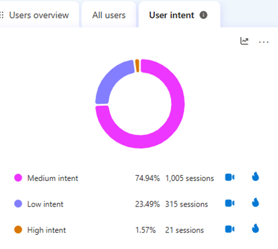
Figure 2. User intent distribution
Most sessions fall into medium intent (74.94%), followed by low intent (23.49%), with only a small share of high-intent visits. This suggests the site should educate and guide users more clearly rather than assuming they are ready to convert instantly.
Figure 3. Traffic sources snapshot
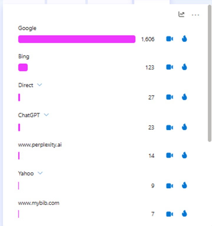
Figure 3. Traffic sources snapshot
Google is the dominant acquisition source by a wide margin, which reinforces why search-led landing page experience matters. When organic search drives most sessions, improvements to post-click clarity can have outsized impact.
Figure 4. Additional referral sources
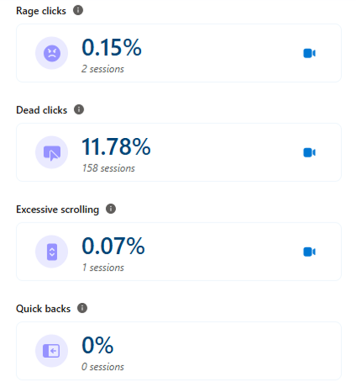
Figure 4. Additional referral sources
The long tail of referrals includes ChatGPT, Facebook, Perplexity, and other websites. This means pages should be understandable even for visitors arriving with mixed context and different expectations.
Figure 5. Browser mix
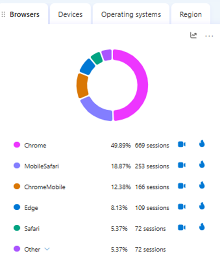
Figure 5. Browser mix
Chrome accounts for roughly half of sessions, while Mobile Safari and Chrome Mobile together represent a large mobile share. That makes responsive design, tap targets, and mobile-first CTA visibility essential in any SXO plan.
Figure 6. Geographic distribution
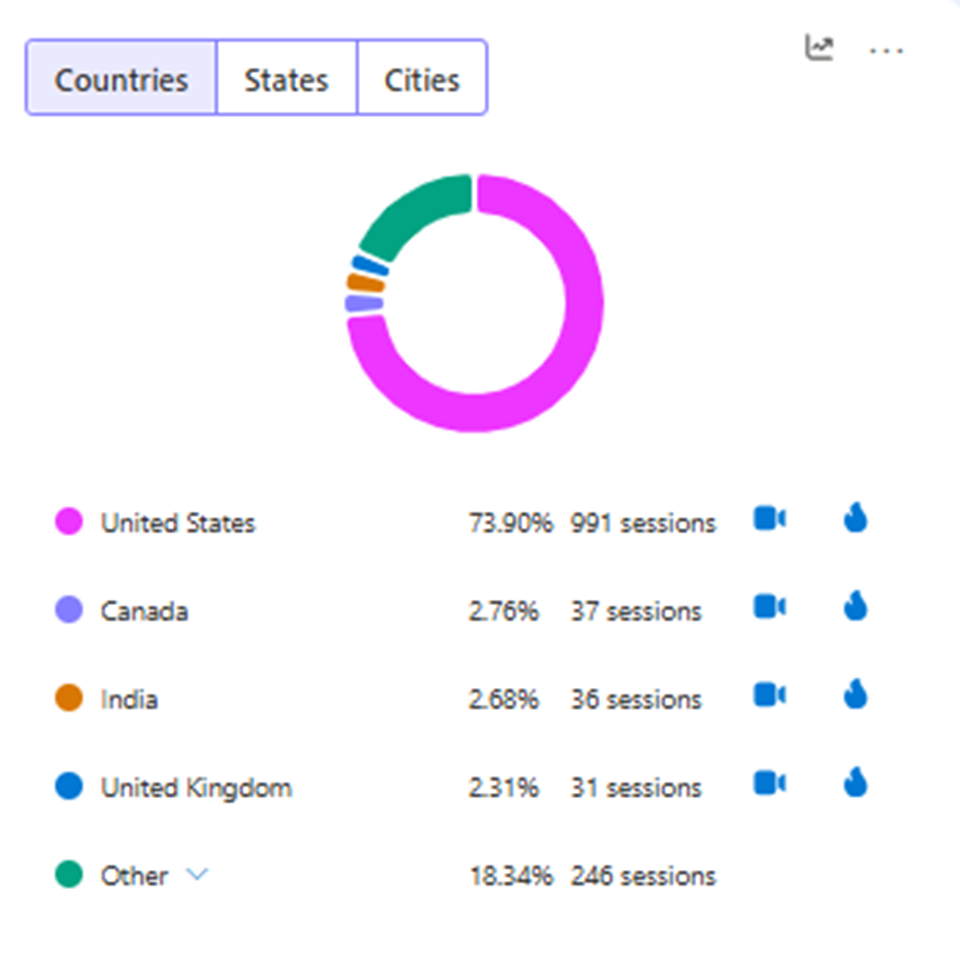
Figure 6. Geographic distribution
The audience is led by the United States, with smaller volumes from Canada, India, and the United Kingdom. Geographic concentration can help prioritize primary audience messaging while still keeping content broadly understandable.
Figure 7. Friction signals
Figure 7. Friction signals
Dead clicks are the clearest friction point here at 11.78%, while rage clicks and excessive scrolling remain low. This is a classic SXO cue that users expect certain elements to work or reveal more information than they currently do.
Figure 8. JavaScript errors view
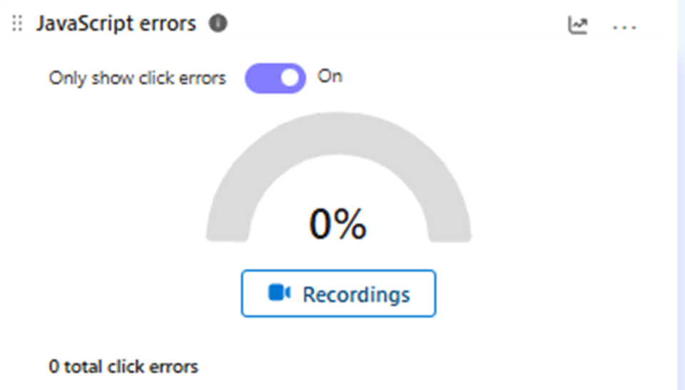
Figure 8. JavaScript errors view
The JavaScript errors panel shows no click-related errors in this sample. That does not remove UX friction, but it helps rule out broken click handling as the main cause of dead-click behavior.
Figure 9. Key action clicks
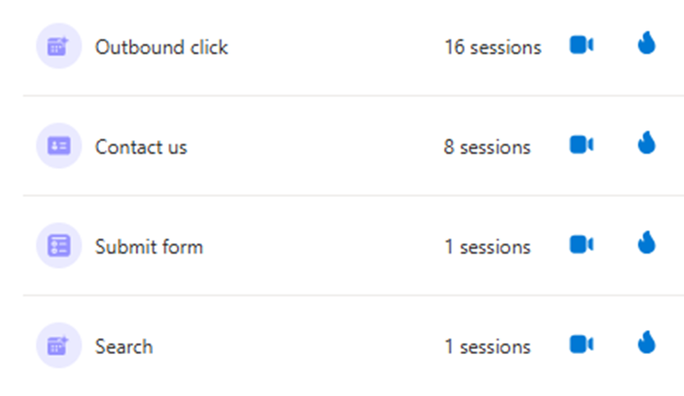
Figure 9. Key action clicks
Outbound clicks, contact interactions, form submits, and search actions can be tracked as meaningful behavioral signals. These are the types of actions SXO teams should measure before and after page changes.
Figure 10. Site performance overview
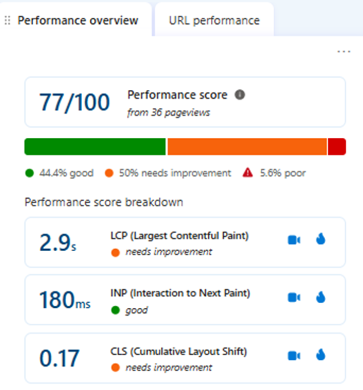
Figure 10. Site performance overview
The overall performance score is 77/100. LCP at 2.9 seconds and CLS at 0.17 both need improvement, showing that experience optimization is not only about copy and layout but also about speed and stability.
Figure 11. URL-level performance
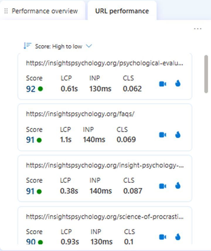
Figure 11. URL-level performance
This report highlights page-level performance differences, helping teams decide which URLs are already strong and which need testing. SXO works best when high-opportunity pages are prioritized instead of treating the site as one uniform experience.
Figure 12. Top pages report
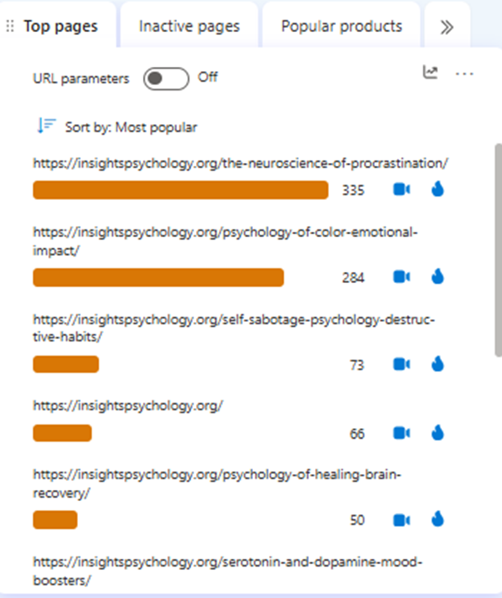
Figure 12. Top pages report
The top pages view identifies the URLs receiving the most attention, including blog content around procrastination and related psychology topics. These high-traffic pages are ideal places to test CTA placement, content hierarchy, and internal linking.
Figure 13. Heatmap click ranking
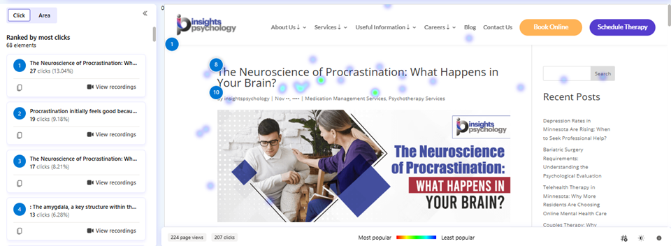
Figure 13. Heatmap click ranking
The click map shows which page elements attract the most interaction and which elements users ignore. This kind of visual evidence is useful when deciding whether the page hierarchy supports the intended journey.
Figure 14. In-page click concentration
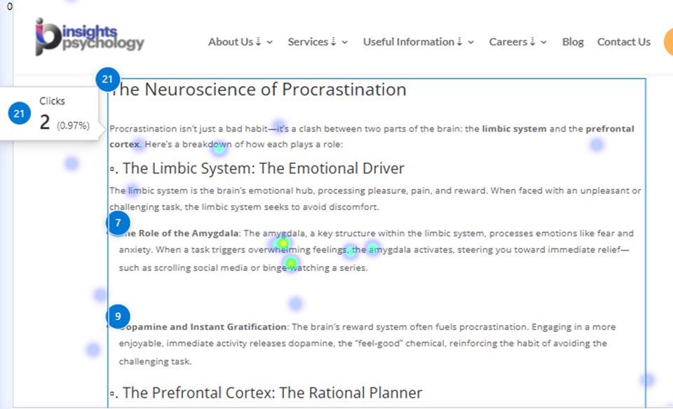
Figure 14. In-page click concentration
The in-page heatmap shows a dense concentration of clicks in the article body and title area. When users interact heavily with content sections, those areas become prime candidates for internal links, sticky prompts, or contextual CTAs.
Figure 15. Scroll-depth heatmap view
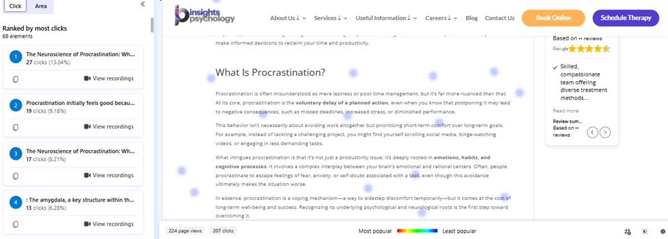
Figure 15. Scroll-depth heatmap view
This screenshot helps illustrate how attention changes as users move further down the page. It is a practical reminder that important actions should not be hidden too low if the goal is to capture engagement earlier.
Figure 16. Combined dashboard snapshots
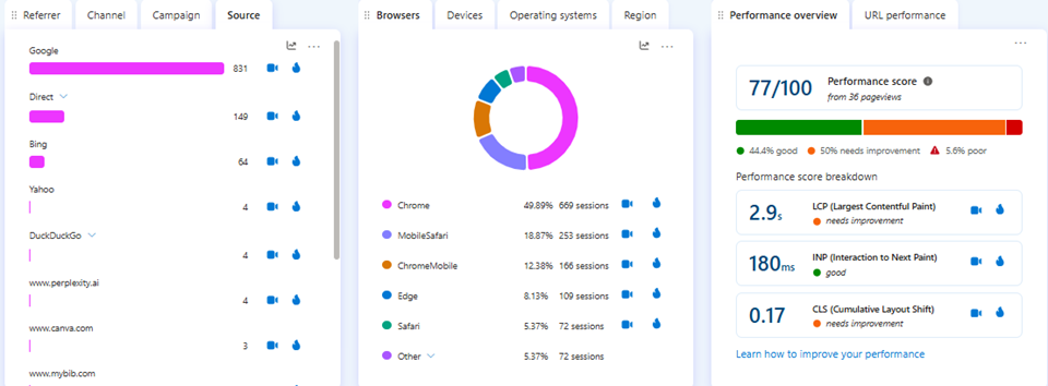
Figure 16. Combined dashboard snapshots
Viewed together, source, browser, and performance reports show why SXO should blend acquisition, usability, and technical experience rather than optimizing each in isolation.