SUPERCHARGE YOUR ONLINE VISIBILITY! CONTACT US AND LET’S ACHIEVE EXCELLENCE TOGETHER!
There are so-called on-site SEO “hot zones” that you can focus on when optimizing your website to rank higher in search engines. As you might expect, we spend a lot of effort figuring out innovative strategies to get to the top page of search results. Google’s #1 result for any given search has double the click-through rate (CTR) of the #2 position, and if you’re not on the first page, you’re effectively dead.
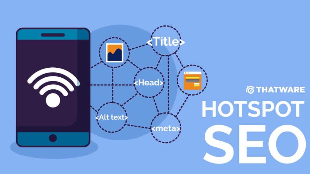
What Are The On-Site SEO Hotspots?
There are six major areas where you may make little changes to get significant results in search engines.
Meta Title And Meta Description
Your title tag and description are usually the first things people notice (SERPs) on search engine results pages. They provide critical information about your websites and each page, so use clear and concise terminology.
Search engines use Meta titles and descriptions to determine what your website is about. They should include highly relevant keywords and call-to-actions (CTAs) to persuade users to click on your links.
HTML Headings
Headings are another tool you can use to improve the efficacy of your pages and organize your content. In HTML, headings are specified by the H1> to H6> elements, from most essential to least significant.
The reason headers are so important in SEO is that search engines love to utilize them to index the structure and content of your pages. If you’re using WordPress, most themes automatically add an H1> heading to the titles of your articles, so you don’t have to. On the other hand, other headers are responsible for being incorporated into your pages correctly.
You should arrange and divide your information into paragraphs separated by H2> subtitles as a general guideline. Headlines, like book chapters, assist the reader in navigating your content without becoming disoriented or irritated. Keywords help, but it’s not a good idea to pack them all over the place in the hopes of getting more hits; a strategy is known as keyword stuffing—i.e., low effort spam.
Text Formatting
Begin enhancing the structure of your content as soon as possible for the greatest SEO outcomes. Understanding that writing for the web is fundamentally different from writing for any other media might differ between a successful piece and one that fails to pique the reader’s interest.
It’s usually a good idea to include your main keyword (i.e., what you want to rank for) straight away and rapidly build up your narrative: people have a million reasons not to bother with your content, so the last thing you want to do is tease them before they get to the meat of it all.
Headings are also useful for spacing out your text and preparing readers for the following. This is also great for skimming through sections you don’t care about. Be mindful that the first line of a paragraph sets the pace while others go into further specifics about this subject (one paragraph = no more than one idea). It’s also why placing your keyword at the start of a phrase produces better results.
Internal Hyperlinks
Google deploys a bot (or spider, same difference) to explore your links to navigate your website. The trip starts with your homepage (otherwise known as your index file).
The bot then attempts to follow a link and begins accumulating data, determining the relationship between different pages, and assigning a value to said content.
The homepage serves as your headquarters and is where you may find the most valuable links. That’s why news outlets and blogs put the most recent information on the front page: Google detects these pieces faster and usually gives them a ranking boost.
A solid internal link strategy starts with your most essential page—home—at the top of the pyramid, followed by cornerstone content—pages with extremely high user value.
Filename and Image Alt Tags
When you upload a new image to your site. The title is normally the same as the filename, and the alt tag is usually left empty.
This Google Photos “best practices” website recommends that you add outstanding descriptions (or alternative text) to your images to begin generating higher-quality traffic to your site.
It’s all about assisting Google in finding and sharing your content with its users.
URL Organization
You can do several things to help your website’s overall success. And some of them are concerned with your URL structure—what you see in the browser after HTTP://. Here are some pointers to help you improve your SEO using URLs.
• Put some keywords that correspond to the content of your page: if you were making a Top 10 of the greatest camgirls in 2019, include “camgirl” (your target keyword) in the URL. Keywords tell search engines what the page is about and might appear in response to a relevant search query.
• Make the URLs easy to read: if a person can’t immediately comprehend what the website is about. A machine can’t either. This implies cutting the fat, i.e., no excessively lengthy URLs with several arguments.
• Keep your URLs short: while search engines don’t mind 100+ character URLs, they provide a terrible user experience. Shorter URLs offer several advantages, from being easier to post on social media to being excellent “type-in” candidates. (yes, people still do it!).
• Don’t be too concerned about stop words: some SEO experts will advise you to avoid stop words (all, for, it, the, and so on) like the plague. Avoiding such phrases may have the unintended consequence of reading them differently from their intended intent. The only reason you’d want fewer of them is to keep your URLs short.
Benefits of Focusing on SEO Hotspots
Focusing on SEO hotspots offers many benefits to businesses that want to build a strong online presence and drive sustainable growth. Here is a comprehensive overview of the benefits:
Higher search engine ranking
Optimizing key SEO points such as page content, content description fields, and technical aspects, websites have a better chance of ranking higher in search engine results pages ( SERPs ). Better ranking means better visibility to potential customers who are actively searching for relevant products or services.
More free traffic
Targeting SEO hotspots ensures that your site attracts more relevant traffic through free searches. By optimizing content with strategic keywords and improving backlink profiles with off-page SEO, businesses can attract users who are genuinely interested in what they have to offer, leading to higher conversion rates.
Improved user experience
Many SEO tactics aimed at search engine optimization also improve user experience. For example, improving website speed not only satisfies search engine algorithms but also ensures a smooth browsing experience for visitors. Also, optimizing content and navigation structures improves readability and usability, which increases engagement and reduces bounce rates.
Competitive Advantage
Focusing on SEO hotspots allows businesses to outperform their competitors in terms of search engine rankings, visibility, and user engagement. By constantly optimizing key areas such as content quality, link profile, and technical performance, brands can stand out and attract more customers who are actively looking for solutions in their niche.
Long-term sustainability
SEO is not a one-time effort, but rather an ongoing process. By prioritizing key SEO hotspots and constantly monitoring and adjusting strategies to evolve search engine algorithms and user behavior, businesses can ensure long-term sustainability in a competitive digital environment. Staying current with SEO practices will help maintain relevance and competitiveness over time.
Cost Effectiveness
Compared to many other marketing channels, SEO can offer a high return on investment (ROI) in the long run. While this may require an initial investment of time, resources, and expertise, the benefits of increased search visibility and organic traffic can provide lasting and sustainable results without the ongoing advertising costs.
Build trust and credibility
A strong presence in search results supported by optimized content, positive reviews, and authoritative links helps build trust and credibility among potential customers. Users are more likely to trust websites that appear at the top of search results and demonstrate expertise in their field.
Measurable Results and Insights
SEO efforts can be tracked and measured using a variety of analytics tools, providing valuable information about website performance, user behavior, and the effectiveness of optimization strategies. This data-driven approach allows companies to refine their SEO tactics and allocate resources more efficiently to the areas that generate the most revenue.
Mobile-Friendliness as a Hotspot: The Game-Changer in SEO Optimization
In the rapidly evolving digital landscape, mobile-friendliness has emerged as a critical SEO hotspot. With the majority of online searches now conducted on mobile devices, search engines like Google have adapted their algorithms to prioritise mobile-friendly websites. This shift, driven by the need to cater to user behaviour and improve search experiences, has transformed mobile optimisation from a luxury into a necessity for businesses seeking sustainable growth in the digital world. Let’s delve into why mobile-friendliness is a vital SEO hotspot, how it impacts rankings, and the steps you can take to optimise your website for mobile users.
The Rise of Mobile Usage: A Paradigm Shift
Mobile devices have revolutionised the way people access the internet. With the advent of smartphones, tablets, and wearable devices, users now expect seamless browsing experiences across all screen sizes. According to recent studies, over 60% of global web traffic originates from mobile devices, and this number is growing steadily. This behavioural shift has forced businesses and search engines to adapt.
In 2018, Google introduced mobile-first indexing, a major update to its algorithm. This means Google primarily uses the mobile version of a website to determine its ranking. For businesses, this emphasises the importance of optimising their websites for mobile users. Websites that fail to provide a mobile-friendly experience risk losing visibility, traffic, and ultimately, revenue.
What Does Mobile-Friendliness Mean?
A mobile-friendly website is one that provides an excellent user experience on smaller screens. It ensures that users can easily navigate, read, and interact with the site without the need for zooming or horizontal scrolling. Here are some characteristics of a mobile-friendly website:
Responsive Design: The site automatically adjusts its layout to fit different screen sizes and resolutions.
Fast Loading Speed: Mobile users are often on the go, so a site that loads quickly retains their attention better.
Easy Navigation: Clear menus, touch-friendly buttons, and intuitive navigation improve usability.
Readable Text: Fonts and text sizes should be legible without requiring zooming.
Optimised Images and Videos: Multimedia content should be resized and compressed for faster loading and better display on smaller screens.
Why Mobile-Friendliness is a Crucial SEO Hotspot
1. Direct Impact on Search Rankings
Google’s mobile-first indexing means that your website’s mobile version is the primary consideration for rankings. A poorly optimised mobile site can drag down your ranking, even if the desktop version is flawless. Websites that are mobile-friendly often receive a ranking boost, making them more visible to potential customers.
2. Improved User Experience
A seamless browsing experience keeps users engaged and reduces bounce rates. When visitors find your website easy to navigate on their mobile devices, they are more likely to explore further, leading to increased time on site and higher conversion rates.
3. Higher Conversion Rates
Mobile-friendly websites are better at converting visitors into customers. Whether it’s completing a purchase, signing up for a newsletter, or filling out a contact form, a smooth mobile experience encourages users to take action.
4. Adaptation to Voice Search Trends
Mobile users increasingly rely on voice search for quick answers. Optimising your site for mobile also enhances its compatibility with voice search, a growing trend that can drive more traffic to your site.
Steps to Optimise Your Website for Mobile-Friendliness
1. Adopt Responsive Web Design
Responsive design ensures that your website automatically adjusts its layout to fit any screen size. This approach eliminates the need for separate desktop and mobile versions, simplifying maintenance and improving consistency.
2. Prioritise Page Loading Speed
Page speed is a critical factor for both user experience and SEO. Tools like Google’s PageSpeed Insights can help you identify areas for improvement. Key actions include:
Compressing images and videos to reduce file sizes.
Minimising CSS, JavaScript, and HTML code.
Leveraging browser caching to load pages faster for returning visitors.
Using a Content Delivery Network (CDN) to serve content from servers closer to the user’s location.
3. Optimise Navigation for Touch Screens
Mobile users interact with websites through touch, so your navigation should accommodate this. Ensure buttons and links are large enough to tap easily without accidental clicks. Implement sticky menus to keep navigation options readily accessible as users scroll through your site.
4. Use Mobile-Friendly Pop-Ups
While pop-ups can be effective for lead generation, intrusive or poorly designed pop-ups can frustrate mobile users and harm your SEO. Use pop-ups sparingly and ensure they are easy to close. Google penalises sites with intrusive interstitials, so design them with care.
5. Focus on Readable Fonts and Layouts
Text readability is crucial on mobile devices. Use a font size of at least 16px for body text and ensure adequate spacing between lines. Break content into smaller paragraphs and use bullet points to enhance scannability.
6. Optimise Images and Multimedia
Images and videos are often the main culprits for slow-loading pages. Use tools like TinyPNG or Squoosh to compress images without sacrificing quality. Opt for modern file formats like WebP, which offer smaller file sizes and faster loading times.
7. Test Across Devices
Regularly test your website on various devices and browsers to ensure compatibility. Tools like Google’s Mobile-Friendly Test or BrowserStack can provide valuable insights into how your site performs across different platforms.
Measuring Mobile-Friendliness
To ensure your optimisation efforts are effective, monitor your site’s performance using analytics tools. Key metrics to track include:
Mobile Bounce Rate: A high bounce rate indicates poor user experience on mobile.
Time on Site: Longer durations suggest users find your content engaging and easy to navigate.
Conversion Rates: Measure the success of your mobile calls-to-action (CTAs).
Additionally, keep an eye on Google Search Console, which provides reports on mobile usability issues, such as clickable elements being too close together or content extending beyond the screen.
The Competitive Edge of Mobile Optimisation
Investing in mobile-friendliness not only enhances your SEO but also provides a competitive edge. As more businesses recognise the importance of mobile optimisation, those that fail to adapt risk falling behind. A mobile-friendly website demonstrates that your brand is forward-thinking and customer-centric, fostering trust and loyalty among users.
Moreover, mobile optimisation supports other digital marketing efforts. For example, it complements social media campaigns by ensuring that visitors clicking through from platforms like Instagram or Facebook have a seamless experience. Similarly, email marketing campaigns benefit from landing pages designed with mobile users in mind.
Future Trends in Mobile SEO
As technology evolves, mobile optimisation will continue to be a focal point of SEO. Emerging trends include:
5G Connectivity: Faster internet speeds will raise user expectations for instant loading times.
Progressive Web Apps (PWAs): Combining the best of websites and mobile apps, PWAs offer offline access, push notifications, and enhanced performance.
Artificial Intelligence (AI): AI-powered personalisation will make mobile experiences more tailored and engaging.
Schema Markup and Rich Snippets: Elevating SEO Through Structured Data
In the world of search engine optimisation, schema markup and rich snippets are often underutilised yet highly effective tools for improving website visibility and user engagement. These techniques enable search engines to better understand your content, presenting it in a more appealing and accessible format to users. This article delves into the importance of schema markup and rich snippets, how they work, and their undeniable impact on SEO performance.
What is Schema Markup?
Schema markup is a form of structured data added to a website’s HTML to help search engines understand the context and meaning of the content. Developed through a collaboration among major search engines (Google, Bing, Yahoo, and Yandex), schema markup provides a standardised vocabulary that enhances how search engines interpret and display content in search results.
Instead of merely indexing your webpage based on keywords, schema markup allows search engines to identify specific elements, such as products, reviews, recipes, events, and more. By doing so, it enables your content to appear in an enhanced format known as rich snippets.
Understanding Rich Snippets
Rich snippets are the enhanced search result formats that incorporate additional data extracted from schema markup. They go beyond the basic title, URL, and meta description by displaying extra information, such as:
Star Ratings: For product reviews or recipes.
Event Dates: For upcoming events.
FAQs: A list of commonly asked questions and their answers.
Images or Videos: To make the result visually engaging.
For example, a standard search result for a recipe might only include the page title and meta description. However, with schema markup, the result could feature an image of the dish, cooking time, and star ratings, making it far more enticing to users.
Why Schema Markup and Rich Snippets are Essential for SEO
1. Improved Click-Through Rates (CTR)
Rich snippets make your search result stand out by offering additional information and visual elements. A result with star ratings or an FAQ list is more likely to attract clicks than a plain-text result. Studies suggest that rich snippets can increase CTR by as much as 30%, driving more traffic to your website.
2. Enhanced User Experience
By providing detailed and relevant information directly in the search results, rich snippets improve the user experience. Users can quickly determine whether your page matches their intent, reducing bounce rates and fostering trust.
3. Higher Rankings in Search Results
Although schema markup itself doesn’t directly boost rankings, its ability to improve CTR, engagement metrics, and user satisfaction indirectly contributes to better SEO performance. Search engines favour pages that provide value to users, and schema markup facilitates this.
4. Voice Search Compatibility
Schema markup plays a significant role in optimising content for voice search. When users ask their virtual assistants questions, the answers often come from structured data, such as FAQs or event details.
5. Competitive Edge
In competitive niches, where multiple businesses target the same keywords, having rich snippets can differentiate your content and position your brand as more authoritative and user-focused.
Types of Schema Markup
There are numerous types of schema markup, each designed for specific content types. Here are some of the most commonly used ones:
Article Schema: For blog posts and news articles, highlighting publication dates, authors, and categories.
Product Schema: For e-commerce websites, displaying product prices, availability, and ratings.
Recipe Schema: For food blogs or cooking websites, including ingredients, cooking time, and nutritional information.
Event Schema: For event organisers, showing event dates, times, and ticket availability.
FAQ Schema: For websites with frequently asked questions, presenting answers directly in the search results.
Local Business Schema: For businesses with physical locations, showcasing addresses, operating hours, and customer reviews.
How to Implement Schema Markup
1. Use Google’s Structured Data Markup Helper
This tool simplifies the process of adding schema markup to your website. By highlighting specific content on your webpage, you can generate the appropriate schema code.
2. Manually Add Schema Markup
If you’re comfortable with coding, you can manually insert schema markup into your website’s HTML. JSON-LD (JavaScript Object Notation for Linked Data) is the recommended format as it’s easy to read and implement.
3. Use Plugins for CMS Platforms
For websites built on content management systems like WordPress, plugins such as Yoast SEO or Schema Pro make it easy to add schema markup without coding.
4. Test and Validate Your Markup
After implementing schema markup, use Google’s Rich Results Test tool to ensure it’s functioning correctly. This step is crucial to avoid errors that might prevent your rich snippets from appearing.
Best Practices for Schema Markup and Rich Snippets
Focus on Relevance: Use schema markup for content that aligns with your target audience’s intent. Overusing or misusing schema types can confuse users and search engines.
Keep it Accurate: Ensure the structured data matches the actual content on your webpage. Inaccurate information can lead to penalties or loss of trust.
Regular Updates: As your content evolves, update your schema markup to reflect new products, reviews, or events.
Combine with Other SEO Efforts: Schema markup works best when paired with other SEO strategies, such as mobile optimisation, keyword research, and quality content creation.
Future Trends in Schema Markup
The use of schema markup is expected to grow as search engines continue to prioritise user intent and experience. Emerging trends include:
AI-Driven Schema Tools: Automating schema creation for dynamic content.
More Rich Snippet Types: As new types of content gain prominence, schema vocabularies will expand.
Integration with Emerging Technologies: Enhancing compatibility with AR, VR, and IoT search interfaces.
Overall, focusing on SEO hotspots offers a wide range of benefits, from increased visibility and traffic to better user experience, competitive advantages, and long-term sustainability. By prioritizing the key areas of search engine optimization and constantly optimizing strategies, companies can effectively reach their target audience, generate results and achieve their marketing goals in the digital world.

Thatware | Founder & CEO
Tuhin is recognized across the globe for his vision to revolutionize digital transformation industry with the help of cutting-edge technology. He won bronze for India at the Stevie Awards USA as well as winning the India Business Awards, India Technology Award, Top 100 influential tech leaders from Analytics Insights, Clutch Global Front runner in digital marketing, founder of the fastest growing company in Asia by The CEO Magazine and is a TEDx speaker and BrightonSEO speaker.
