SUPERCHARGE YOUR ONLINE VISIBILITY! CONTACT US AND LET’S ACHIEVE EXCELLENCE TOGETHER!
To guarantee peak performance and user satisfaction, website owners and developers must keep an eye on Chrome User Experience (UX) metrics. These metrics offer insightful information about how users engage with a website and its overall performance, including speed, responsiveness, and visual stability. Website owners can find areas for improvement, diagnose performance problems, and improve the user experience overall by regularly monitoring Chrome UX metrics.
The Chrome User Experience Report (CrUX) from Google gathers anonymized data from actual users’ browsing activities and provides a thorough overview of how well websites function on various devices, in various network environments, and various geographic locations. First Contentful Paint (FCP), Largest Contentful Paint (LCP), and Cumulative Layout Shift (CLS), three crucial metrics that measure page load speed, visual stability, and overall user experience, are provided by CrUX.
Website owners can use Google Data Studio, a potent tool for building interactive dashboards and reports, to efficiently analyze and visualize Chrome UX data. With the help of Data Studio, users can establish connections with a variety of data sources, such as the Chrome UX Report, and produce dynamic visualizations that facilitate in-depth examination and investigation of UX metrics.
Website owners can discover areas for improvement, track the effects of optimizations over time, and obtain actionable insights into performance trends by integrating Chrome UX data into Data Studio. Users can see Chrome UX metrics in conjunction with information from other pertinent data sources, like Google Analytics or Search Console, using Data Studio’s configurable dashboards, which offer a thorough understanding of user behavior and website performance.
Querying Chrome UX Data in BigQuery
We will look at how to incorporate Chrome UX data into Data Studio and make interactive dashboards for in-depth reporting and analysis in this guide. We will walk through how to connect to the Chrome UX Report data source, create custom visualizations, and create interactive dashboards that offer insightful information about the functionality and user experience of websites. Website owners may efficiently track Chrome UX metrics, improve performance, and provide their users with an outstanding experience by using Data Studio.
Website owners can analyze and gain insights from user experience metrics with powerful capabilities when they use SQL to query Chrome UX data in Google BigQuery. Aggregated data from actual user experiences is collected and stored in the Chrome User Experience Report (CrUX) dataset in BigQuery. This allows for a thorough examination of important metrics like Cumulative Layout Shift (CLS), First Contentful Paint (FCP), and Largest Contentful Paint (LCP).
The CrUX dataset in BigQuery is composed of multiple tables, each of which contains distinct subsets of UX metrics aggregated by origin and origin-level characteristics like Chrome version, device type, and country. A few of the available tables are chrome-ux-report.month.* and chrome-ux-report.country.*, which offer UX metrics aggregates at the monthly and national levels, respectively.
Users can use SQL to filter, aggregate, and transform Chrome UX data in BigQuery to derive valuable insights. SQL queries can be used for several different tasks, including:
- Data Filtering: To concentrate on pertinent subsets of data, choose particular dimensions and metrics of interest. Then, filter the data according to parameters like origin, device type, or metric thresholds.
- Data Aggregation: To determine averages, medians, percentiles, or other summary statistics to comprehend overall performance trends, combine UX metrics across dimensions.
- Transforming Data: To compare performance across various dimensions, transform data, compute derived metrics, or normalize data. These steps will transform raw data into actionable insights.
For instance, a SQL query can determine the median LCP for each device category and aggregate LCP values by device type:
By connecting Google Data Studio to the BigQuery dataset, the desired data can be visualized in Data Studio after it has been extracted and processed using SQL queries in BigQuery. With Data Studio, users can generate interactive dashboards and reports to visualize Chrome UX metrics and obtain useful insights into the performance and user experience of websites.
Creating Data Studio Reports
Creating reports in Data Studio is a straightforward process that allows users to visualize data from various sources and customize the layout and design to meet specific needs. Here’s how to design a new report in Data Studio:
1. Selecting Data Sources:
Begin by selecting the appropriate data sources for your report. Data Studio supports a wide range of data connectors, including Google Analytics, Google Sheets, Google BigQuery, and many others. Choose the data sources that contain the metrics and dimensions you want to analyze and visualize in your report.
2. Introduction to Data Studio Components:
Data Studio offers a variety of components for building reports, including charts, tables, scorecards, and more:
- Charts: Charts allow you to visualize data in different formats such as line charts, bar charts, pie charts, and scatter plots. You can customize chart types, axes, colors, and styles to best represent your data.
- Tables: Tables display data in tabular format, making it easy to view and analyze raw data. Tables can be customized with sorting, filtering, and conditional formatting options.
- Scorecards: Scorecards display single metric values or key performance indicators (KPIs) in a visually appealing format. You can customize scorecards with thresholds, colors, and icons to highlight important metrics.
3. Customizing Report Layout and Styles:
Once you’ve added components to your report, you can customize the layout, styles, and themes to match branding and presentation requirements:
- Layout: Arrange components on the report canvas to create a logical flow of information. Use containers and grids to organize components neatly and efficiently.
- Styles: Customize the style of individual components, including fonts, colors, borders, and backgrounds. Ensure consistency in styling to maintain a cohesive look and feel throughout the report.
- Themes: Choose a theme for your report to apply consistent styling across all components. Data Studio offers built-in themes and allows you to create custom themes to match your branding.
By selecting appropriate data sources, leveraging Data Studio components effectively, and customizing the report layout and styles, users can create visually appealing and informative reports that provide valuable insights into their data. With Data Studio’s flexibility and customization options, reports can be tailored to meet the specific needs of stakeholders and effectively communicate key metrics and findings.
The Chrome User Experience Report helps us with real-world measurements of key metrics that help determine the User Experience for any website in Google Index. These metrics are derived directly from the Chrome user data and give us an idea about the real-world challenges faced by real-world Chrome users.

This data can be accessed via the following methods:
- PageSpeed Insights, which provides URL-level user experience metrics for popular URLs that are known by Google’s web crawlers.
- Public Google BigQuery project which aggregates user experience metrics by origin, for all origins that are known by Google’s web crawlers, and split across multiple dimensions outlined below.
- CrUX Dashboard on Data Studio, which can be set up to track an origin’s user experience trends.
- CrUX API, which provides metrics by origin and urls.
In this article, we will be discussing how to generate the Chrome UX report using Data Studio.
Getting Started
- On a new tab open the URL: g.co/chromeuxdash
- On the resulting window enter your website url:
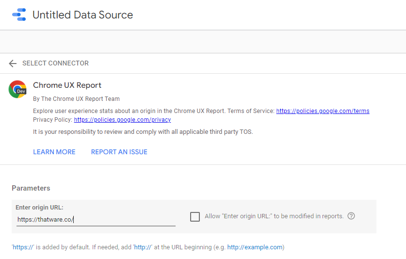
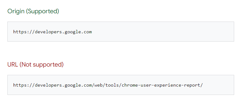
Beware, to use the following URL formats:
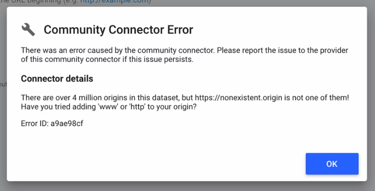
If your origin(website) is not included in the CrUX dataset then you may get the following message:
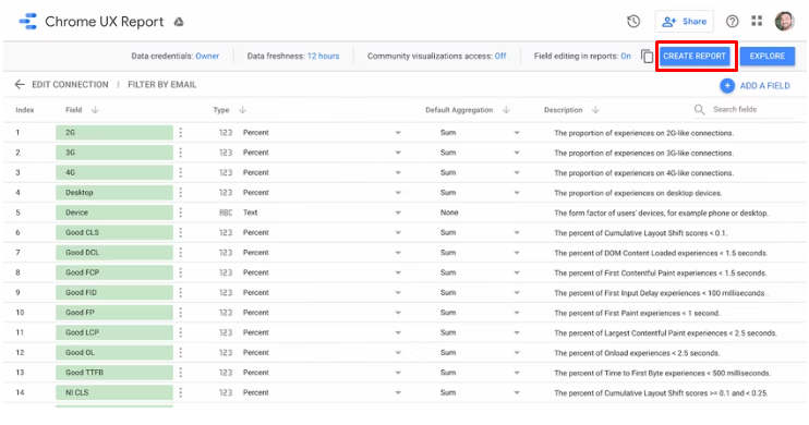
If the origin exists, the schema page will open which consists of all the parameters in the data set that will fetch to create the report.
Click on Create Report to generate the CrUX Dashboard.
Dashboard Overview
- Core Web Vitals overview
- Metric performance
- User demographics
Advanced Insights into Chrome UX Data Analysis
Incorporating Machine Learning into UX Analysis
Machine learning (ML) can elevate your Chrome UX analysis by uncovering patterns and predicting future trends. Using tools like BigQuery ML, you can create predictive models based on historical data.
Steps to Implement ML for UX Analysis
Data Preprocessing: Clean and normalize your CrUX data using SQL queries to remove anomalies and outliers.
Feature Selection: Identify essential metrics like LCP, FID, CLS, and others to serve as input variables.
Model Training: Train classification or regression models using BigQuery ML.
Evaluation: Assess model accuracy using metrics like RMSE (Root Mean Square Error) and R-squared values.
Prediction: Use the model to predict future performance trends and plan optimization strategies.
Using Segmentation for Deeper Insights
Segmentation involves breaking down your CrUX data into smaller, more meaningful groups for analysis. This helps identify specific issues that different user segments experience.
Common Segmentation Approaches
Device Type: Analyze differences between mobile and desktop experiences.
Geolocation: Evaluate performance by region or country.
Network Type: Compare user experiences on 3G, 4G, and Wi-Fi.
Page Type: Segment data by different landing pages or critical user journeys.
Benchmarking Against Competitors
Benchmarking your website’s performance against competitors can provide invaluable insights into where you stand in the market and how you can improve. By leveraging the Chrome User Experience (CrUX) data and visualizing it in Data Studio, you can make informed decisions to enhance user experience and overall website performance.
Why Benchmarking Matters
Competitor benchmarking helps you identify areas where your website is underperforming compared to others in your industry. It enables you to:
- Understand competitive advantages and disadvantages.
- Pinpoint specific areas for improvement.
- Validate the effectiveness of your optimization efforts.
- Set realistic, data-driven goals.
Tools Required for Benchmarking
- CrUX Dashboard: Provides real-world UX data from Chrome users.
- Google BigQuery: Allows querying large datasets efficiently.
- Google Data Studio: Offers customizable visualizations and reports.
- SimilarWeb or Ahrefs: Helps identify competitor URLs and estimate traffic data.
How to Benchmark Effectively
Follow these steps to conduct an effective benchmarking analysis:
1. Identify Competitors
Start by selecting relevant competitors. Tools like SimilarWeb and Ahrefs can provide a list of your competitors based on similar industry presence, traffic volume, and keyword overlap. Choose competitors with similar audience demographics and market positioning for a more accurate comparison.
2. Query CrUX Data Using BigQuery
Once you have a list of competitor URLs, you can query CrUX data using Google BigQuery. Here’s a sample SQL query to retrieve relevant metrics:
SELECT origin, fcp, lcp, cls, fid
FROM `chrome-ux-report.all.2024`
WHERE origin IN (‘https://competitor1.com’, ‘https://competitor2.com’, ‘https://yourwebsite.com’)
This query will fetch key Core Web Vitals metrics such as First Contentful Paint (FCP), Largest Contentful Paint (LCP), Cumulative Layout Shift (CLS), and First Input Delay (FID) for your website and competitors.
3. Visualize Data Using Data Studio
- Create a New Report: Open Data Studio and connect your BigQuery dataset.
- Add Data Visualizations: Use bar charts, line graphs, or scatter plots to compare metrics.
- Customize Views: Add filters for device type (mobile, desktop) or geographic location.
- Highlight Insights: Use conditional formatting to visually emphasize areas where your site is lagging.
4. Analyze and Interpret Results
- Performance Gaps: Identify specific metrics where competitors outperform your site.
- Trend Analysis: Track how performance changes over time.
- User Experience Insights: Recognize design or technical decisions contributing to superior competitor performance.
Prioritizing Optimizations
Once you’ve identified performance gaps, prioritize improvements using the following criteria:
- Impact: Focus on metrics with the highest impact on user experience, like LCP and CLS.
- Feasibility: Evaluate which fixes can be implemented quickly versus long-term projects.
- Competitor Strengths: Learn from competitors’ successes and adapt effective strategies.
By maintaining regular competitor benchmarking using CrUX data, you can stay informed about market trends, validate the effectiveness of optimizations, and ensure your website consistently delivers an exceptional user experience.
Automating CrUX Reporting with Data Studio
Manual reporting can be time-consuming, especially when you need to provide regular updates on user experience (UX) metrics. Automating reports using Google Data Studio offers a streamlined, efficient solution. By integrating with BigQuery, you can create dynamic dashboards that provide real-time insights without the need for constant manual intervention. This ensures stakeholders have access to the most recent data, promoting informed decision-making.
Benefits of Automation
- Real-Time Insights: With automated reports, stakeholders receive up-to-date information directly from the CrUX database.
- Time-Saving: No need for manual data extraction and formatting.
- Custom Visualizations: Tailor reports with charts and graphs that best represent your data.
- Improved Decision-Making: Identify performance trends quickly and address any issues promptly.
- Efficient Communication: Schedule automated reports to be shared with stakeholders via email or through direct access to dashboards.
Steps to Automate Reports
1. Connect Data Studio to BigQuery
- Open Data Studio and select Create a Report.
- Choose BigQuery as your data source.
- Authenticate using your Google Cloud account and select the appropriate CrUX dataset.
- Build a query using SQL to extract specific metrics (e.g., LCP, FID, CLS) for your site.
2. Use Scheduled Queries for Automatic Updates
- In BigQuery, configure scheduled queries to run at your desired frequency (e.g., daily, weekly).
- Save query results to a dedicated table for easy visualization.
- Enable email notifications to monitor query execution status.
3. Create Dynamic Visualizations
- Utilize Data Studio’s drag-and-drop interface to add charts, tables, and graphs.
- Implement interactive elements such as date filters and dropdown menus.
- Apply conditional formatting to highlight data trends and anomalies.
- Visualize key metrics using time series charts for better analysis.
4. Set Up Email Notifications
- In Data Studio, configure scheduled email delivery for reports.
- Choose report recipients and specify the delivery frequency.
- Attach report snapshots as PDFs or provide direct access links.
- Customize the subject line and message to align with stakeholder preferences.
Additional Tips for Effective Automation
- Use Templates: Start with a Data Studio template for CrUX reporting to speed up the setup process.
- Incorporate Benchmarks: Add competitor data for comparative insights.
- Monitor Report Performance: Ensure reports load quickly by optimizing query performance and minimizing data size.
- Add Commentary: Provide context for key metrics through descriptive captions or annotations.
- Enable Alerts: Integrate with Google Sheets or Slack to trigger alerts if critical UX metrics deteriorate.
Conducting A/B Testing Using UX Data
A/B testing allows you to test changes to your site and measure their impact on user experience metrics.
How to Perform A/B Testing
Identify the key metrics to monitor during the test.
Divide users into control and experimental groups.
Implement changes on the experimental group.
Track LCP, FID, and CLS to observe performance differences.
Analyze results in Data Studio using comparative visualizations.
Advanced Visualization Techniques in Data Studio
Data Studio offers powerful visualization options to enhance your Chrome UX reports.
Best Practices for Visualization
Use heat maps to display regional performance variations.
Create funnel charts to track user journeys across pages.
Implement trend lines to observe performance over time.
Build interactive filters to allow stakeholders to drill down into specific segments.
Monitoring Core Web Vitals Using Alerts
Monitoring your website’s performance in real-time is crucial to maintaining an optimal user experience. By setting up automated alerts, you can quickly detect when key performance metrics like Largest Contentful Paint (LCP), First Input Delay (FID), or Cumulative Layout Shift (CLS) fall below acceptable thresholds. This proactive approach helps your team address issues before they significantly impact users.
Step 1: Set Up Google Cloud Monitoring
Google Cloud Monitoring provides a reliable way to track your CrUX data stored in BigQuery. Follow these steps to configure it:
- Access Google Cloud Console: Log in to your Google Cloud account and navigate to the Cloud Monitoring section.
- Create a Workspace: If you don’t have one, create a Monitoring Workspace and link it to your BigQuery project.
- Enable Monitoring APIs: Ensure the Cloud Monitoring and BigQuery APIs are enabled.
Step 2: Configure Metrics and Thresholds
Define the specific performance metrics you want to monitor. CrUX data includes essential Core Web Vitals like:
- Largest Contentful Paint (LCP): Ideal is under 2.5 seconds.
- First Input Delay (FID): Should be below 100 milliseconds.
- Cumulative Layout Shift (CLS): A score of less than 0.1 is recommended.
To set up conditions:
- Create a Monitoring Policy: In the Cloud Monitoring dashboard, select ‘Create Policy.’
- Add a Metric Condition: Choose BigQuery as the data source and select the relevant metric.
- Set Thresholds: Define your acceptable performance thresholds based on Google’s recommendations.
- Select Aggregation Options: You can aggregate data using percentile or average values for better analysis.
Step 3: Configure Notification Channels
Once your conditions are set, you’ll need to configure how you receive alerts. Google Cloud Monitoring supports various notification channels, including:
- Email Notifications: Send alerts directly to relevant stakeholders.
- Slack Integration: Connect Slack channels to receive instant alerts for collaborative issue resolution.
- SMS or PagerDuty: For mission-critical monitoring, configure SMS or third-party integrations like PagerDuty.
To configure:
- Go to the Notification Channels tab in Cloud Monitoring.
- Add a new channel and input the required details (e.g., Slack Webhook URL or email addresses).
- Link the channel to your monitoring policy.
Step 4: Test and Adjust Alerts
Before going live, test your alerting system:
- Simulate a Performance Drop: Adjust sample data to trigger a test alert.
- Verify Notifications: Ensure stakeholders receive notifications as configured.
- Refine Thresholds: Fine-tune thresholds based on actual performance trends.
Future Trends in Chrome UX Data Analysis
The field of UX analysis continues to evolve. Emerging trends include:
AI-Driven Insights: Predictive algorithms for more accurate performance predictions.
Augmented Reality (AR) Monitoring: Evaluating AR experiences using CrUX data.
Enhanced Data Privacy: Balancing data analysis with user privacy regulations.
Core Web Vitals Overview
The first tab gives you an overview of all the major Core Web Vitals metrics. You can check it for both Mobile and Desktop versions.
Metric Performance
This consists of a series of tabs LCP, FID, CLS, FCP, INP and TTFB metrics. All these tabs share data regarding each individual Core Web Vital metric.
Each tab consists of the Device filter.
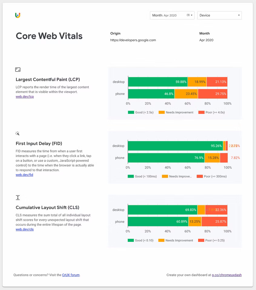
The primary visualizations on these pages are the monthly distributions of experiences categorized as “Good”, “Needs Improvement”, and “Poor”. The colour-coded legend below the chart indicates the range of experiences included in the category. For example, in the screenshot above, you can see the percentage of “good” Largest Contentful Paint (LCP) experiences fluctuating and getting slightly worse in recent months.
The most recent month’s percentages of “good” and “poor” experiences are shown above the chart along with an indicator of the percent difference from the previous month. For this origin, “good” LCP experiences fell by 3.2% to 56.04% month-over-month.
Additionally, for metrics like LCP and other Core Web Vitals that provide explicit percentile recommendations, you’ll find the “P75” metric between the “good” and “poor” percentages. This value corresponds to the origin’s 75th percentile of user experiences. In other words, 75% of experiences are better than this value. One thing to note is that this applies to the overall distribution across all devices on the origin. Toggling specific devices with the Device filter will not recalculate the percentile.
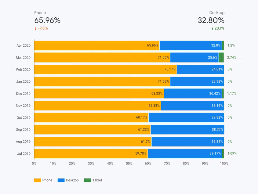
User Demographics
Lastly the User Demographics data (Labelled as the “Device Distribution” Tab). The device distribution page shows you the breakdown of phone, desktop, and tablet users over time. Many origins tend to have little to no tablet data so you’ll often see “0%” hanging off the edge of the chart.