Get a Customized Website SEO Audit and Online Marketing Strategy and Action
In the ever-evolving world of Search Engine Optimization (SEO), staying ahead of the competition requires not only technical expertise but also an ability to analyze website structure efficiently. One of the most visually intuitive and powerful tools to assist in this analysis is the Force-Directed Crawl Diagram. This guide will walk you through understanding, interpreting, and leveraging these diagrams to optimize your website for SEO.
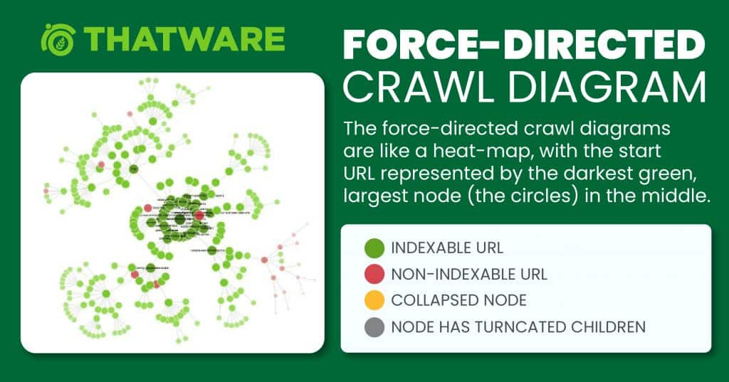
The force-directed crawl diagrams are like a heat-map, with the start URL represented by the darkest green, largest node (the circles) in the middle. This is generally the homepage if you started the crawl there. The lines (known as ‘edges’) represent the link between one URL and another.
What Is a Force-Directed Crawl Diagram?
A Force-Directed Crawl Diagram is a visualization that represents the structure of a website. It illustrates the relationships between pages (nodes) and the links (edges) that connect them. Typically, the diagram is generated using tools like Screaming Frog, a leading website crawler tool in the SEO industry. Here are the main features of this diagram:
- Nodes (Circles): Represent individual URLs or pages on your website.
- Green Nodes: Indexable pages (search engines can crawl and index these pages).
- Red Nodes: Non-indexable pages (pages that search engines cannot index, potentially due to redirects, no-index tags, or other issues).
- Edges (Lines): Represent links between pages. The thickness and length of the edges can give insights into the structure of your website.
- Color Intensity: Indicates the page’s importance, with darker colors typically representing pages with higher authority (such as the homepage).
The central node is usually the starting point of the crawl, often the homepage.
Generating a Force-Directed Crawl Diagram
To create this diagram for your website, follow these steps:
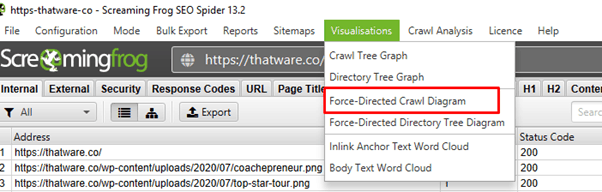
- Launch Screaming Frog: Open Screaming Frog and input your website’s URL.
- Start the Crawl: Begin the crawl process to map out all the URLs and links.
- Visualize the Crawl: Once the crawl is complete, navigate to the Force-Directed Crawl Diagram option in the Screaming Frog interface.
- Export the Diagram: For documentation or detailed analysis, export the diagram as an image or PDF file.
Understanding the Diagram
Legends to Identify URL Status
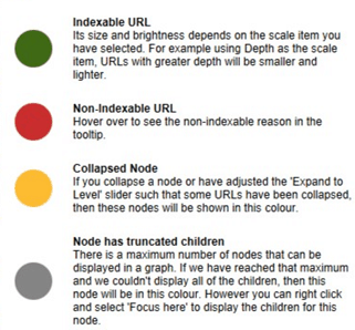
- Green Nodes: Represent pages that are indexable. These are healthy pages that search engines can easily discover and rank.
- Red Nodes: Represent pages that are non-indexable. These could include:
- Redirected URLs.
- Pages with a “no-index” directive.
- Broken links or error pages.
Key Elements to Analyze
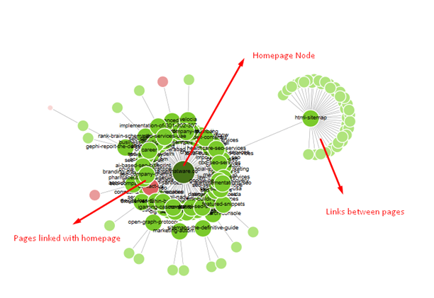
- Central Node: The starting point of the crawl, typically your homepage. This is represented as the darkest and largest node.
- Larger Nodes: Pages with higher internal authority, often because they receive more internal links.
- Longer Lines: Indicate structural relationships between pages. A long edge might show a page that’s harder to reach within your website structure.
Example Analysis
A Problematic Website Structure
Let’s take a closer look at an example Force-Directed Crawl Diagram:
- Observation: Some nodes (URLs) are red, indicating non-indexable pages.
- Root Cause: These pages are either permanently redirected or have directives preventing them from being crawled.
- Actions:
- Redirected URLs: If a URL is permanently redirected to another page (e.g., https://thatware.co/contact-us/), no action is required.
- Non-Crawlable Pages: Investigate why these pages are non-indexable. Fix any issues related to robots.txt, meta tags, or server settings if necessary.
A Healthy Website
In contrast, a well-optimized site’s diagram would have the following characteristics:
- Green Nodes Dominating: Most pages are indexable and connected.
- Balanced Structure: Pages are evenly distributed, with a logical hierarchy leading from the homepage to category and subcategory pages.
- Shorter Edges: Indicates a clean, logical link structure that search engines can efficiently crawl.
Benefits of Using Force-Directed Crawl Diagrams for SEO
- Visualizing Website Structure:
- Provides a bird’s-eye view of how pages are interconnected.
- Makes it easier to identify structural anomalies and bottlenecks.
- Identifying Crawl Issues:
- Pinpoint non-indexable or orphaned pages (pages with no incoming links).
- Spot broken links or redirect chains.
- Enhancing Internal Linking:
- Highlight pages that are underlinked and require more internal links for better authority distribution.
- Improve the flow of link equity across your website.
- Diagnosing SEO Problems:
- Quickly identify pages that may not be performing well due to poor crawlability or linking.
- Ensure that key pages are easily accessible to search engines.
- Optimizing Page Authority:
- Larger nodes indicate high-authority pages. Use this information to strategically link to other pages to boost their rankings.
SEO Best Practices Using Force-Directed Crawl Diagrams
Here are actionable steps to improve your website’s SEO using insights from the Force-Directed Crawl Diagram:
1. Optimize Internal Linking Structure
- Ensure that all important pages have adequate internal links pointing to them.
- Reduce the number of clicks needed to reach important pages from the homepage (e.g., flatten the site hierarchy).
2. Fix Non-Indexable Pages
- For pages marked in red:
- If redirected, ensure the redirection is intentional and beneficial.
- For pages with “no-index” tags, assess if they should be indexed.
- For broken links, update or remove them.
3. Consolidate Redirect Chains
- Redirect chains waste crawl budget and slow down crawling. Ensure all redirects are direct and efficient.
4. Improve Crawl Depth
- Pages buried too deep in your site structure are harder for search engines to find. Aim for a maximum depth of three clicks for key pages.
5. Prioritize High-Authority Pages
- Use larger nodes as benchmarks for authority distribution. Link to low-authority pages from these high-authority pages to spread link equity.
Advanced Use Cases
1. Analyzing Competitor Sites
Generate a Force-Directed Crawl Diagram for competitor websites (where allowed). Identify:
- How their pages are structured.
- Opportunities to improve your own structure based on their strengths.
2. Monitoring Site Changes
Periodically regenerate the diagram to:
- Track the impact of your SEO changes.
- Ensure no new crawl issues arise after significant updates (e.g., a redesign or migration).
3. E-commerce Optimization
For e-commerce sites:
- Ensure product pages are not orphaned.
- Optimize category pages (usually lighter blue nodes) for better interlinking and authority distribution.
Tools and Resources
While Screaming Frog is the go-to tool for generating these diagrams, consider supplementing your analysis with the following:
- Google Search Console: Cross-check indexing issues identified in the diagram with reports in Search Console.
- Ahrefs or SEMrush: Use these tools to assess backlink profiles and external links pointing to key pages.
- Sitebulb: Another crawler that offers visual representations of website structure, including force-directed graphs.
Manual Auditing: Combine insights from the diagram with manual reviews to validate
In order to get the report, we have run the test in Screaming Frog. And to get the below diagram you need to head towards as follows:
Website’s Present Diagram as follows:
Legends to identify the status of the URL:
Indexable pages are represented by the green nodes, while the pastel red highlights URLs that are non-indexable. This makes it quite easy to spot problematic sections or pages of a website.
Synopsis:
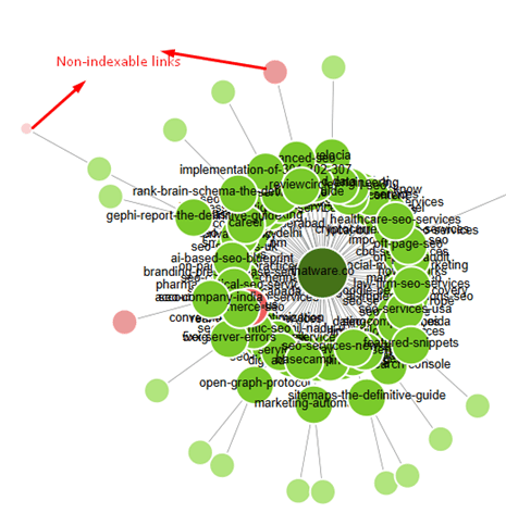
As you can notice in the above diagram that there are some non-indexable url or non-crawlable links have been spotted in red circle.
Analysis:
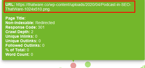
We have found from the link wheel, the afore-mentioned url has been redirected. This has been permanently redirected to a specific page. No action needed here.
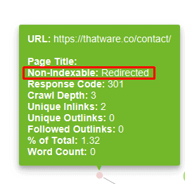
We have found from the link wheel, the afore-mentioned url has been redirected. This has been permanently redirected to a specific page (https://thatware.co/contact-us/). No action needed here.
SEO Using Force Directed Crawl Diagrams
Generally, the only way to understand a site is to look deep into the technology stack and gaze upon its dark. But we at ThatWare try to avoid contact with evil beings. Instead, we use force-directed crawl diagrams. Here are a few examples:
A Healthy Site
Here’s a force-directed crawl diagram for a healthy website:
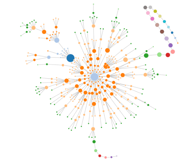
And, here’s an explanation:
- Larger dots = Moreover, this indicates pages with higher internal authority
- Longer lines = Line length generally shows structural relationships between pages.
- Basically, the dark blue dot is the home page.
- Lighter blue are ‘category’ pages that link from the home page to others.
Conclusion
Force-Directed Crawl Diagrams are a powerful yet underutilized tool in the SEO arsenal. They provide a comprehensive, visual representation of your website’s structure, making it easier to identify issues, optimize internal linking, and improve overall crawlability. By incorporating these diagrams into your SEO strategy, you can ensure that search engines navigate your site efficiently, resulting in better rankings and user experiences.
To achieve the best results, combine insights from these diagrams with other SEO practices and regularly monitor your site’s performance. In doing so, you’ll create a robust foundation for sustained organic growth.